


Pie Chart Widget
The Pie Chart widget is a visualization
tool that displays data in a circular format, divided into segments. This
widget type helps visualize proportional relationships between different
data points, and displays results of one single field at a time: for
example, the pie in Figure 234, “Pie Chart” displays the
distribution of different values from a single field — the
method field, which shows HTTP
methods:
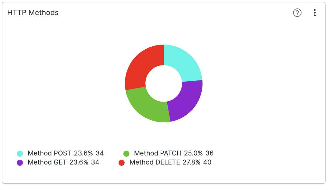 |
Figure 234. Pie Chart
Review these sections for Pie Chart widget
details: