
Github Push Events
Compute at what times during a week are there most activities on Github based on push events.
Visualization: The heat map displays GitHub push activity patterns across a weekly cycle, creating a two-dimensional grid where:
X-axis (horizontal) shows days of the week (1-7)
Y-axis (vertical) shows hours of the day (0-23)
The cell color and intensity shows the total commits: darker color for higher commit activity, lighter color for lower commit activity, white color for no activity.
Each cell in the heat map grid represents a specific day-hour combination:
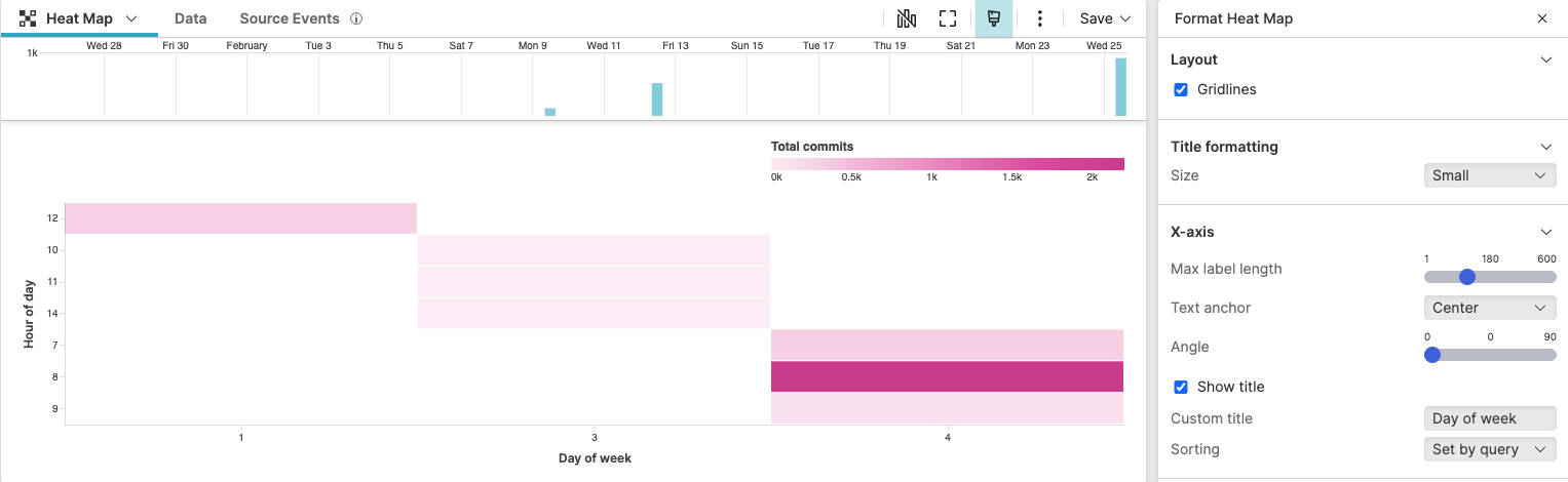 |
Figure 224. Github Push Events
Sample input data:
| commits | repo | timestamp | type | user |
|---|---|---|---|---|
| 3 | myapp | 2025-08-11T09:15:23Z | PushEvent | dev1 |
| 1 | myapp | 2025-08-11T14:30:24Z | PushEvent | dev2 |
| 2 | backend | 2025-08-12T10:45:25Z | PushEvent | dev3 |
| 4 | frontend | 2025-08-12T16:20:26Z | PushEvent | dev1 |
| 1 | myapp | 2025-08-13T11:05:27Z | PushEvent | dev4 |
| 2 | backend | 2025-08-13T15:40:28Z | PushEvent | dev2 |
| 3 | frontend | 2025-08-14T08:55:29Z | PushEvent | dev3 |
| 2 | myapp | 2025-08-14T13:10:30Z | PushEvent | dev1 |
| 1 | backend | 2025-08-15T10:25:31Z | PushEvent | dev4 |
| 3 | frontend | 2025-08-15T14:50:32Z | PushEvent | dev2 |
Query:
type=PushEvent
| dayOfWeek := time:dayOfWeek(@timestamp)
| hourOfDay := time:hour(@timestamp)
| groupBy([dayOfWeek, hourOfDay], function=sum(commits, as=TotalCommits))
Query breakdown:
Filter events to ensure only Git push events are analyzed.
Extract the day of the week from the @timestamp field using the
time:dayOfWeek()function and stores the result in a new field named dayOfWeek.Extract the hour of the day (0-23) from the @timestamp field using the
time:hour()function and stores the result in a new field named hourOfDay.Group events by both dayOfWeek and hourOfDay, creating a two-dimensional aggregation matrix. For each unique combination of day and hour, the query sums the total number of commits.
Configuration:
From the
Searchpage, type your query in the Query Editor → clickChoose in the Widget selector
Click the style icon : this opens the Format panel on the side where some properties are already configured by default based on the query result.
Modify some other widget's properties to obtain the look and feel of this heat map. For example:
In Layout, tick the checkbox to show cell borders.
In X-axis and Y-axis, enter a preferred custom title.
In Colors, change the palette from the default color to magenta.
You can further customize this widget by setting more properties, see Heat Map Property Reference.