


Heat Map Widget
The Heat Map widget is a colorized grid
chart that displays a central variable of interest across two-axis
variables. In LogScale, this is typically the result of grouping
on two categorical variables or binned numerical values.
See an example of how this widget may look like in Figure 229, “Heat Map widget”.
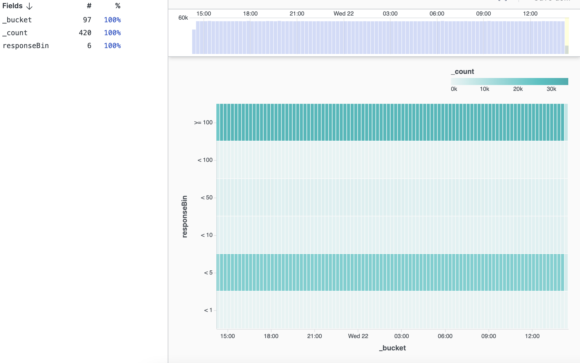 |
Figure 229. Heat Map widget
Review these sections for Heat Map widget
details: