
Thread Usage
Visualizes the relationship between classes and threads, showing which classes use which threads and how frequently (indicated by edge thickness). This is useful for identifying patterns, bottlenecks, or resource allocation in multi-threaded applications.
Visualization: in this scenario, the widget visualizes which classes use which threads in a service. The left side shows different class values appearing as source nodes. The right side shows different thread values appearing as target nodes. Lines flow from each class to each thread: thicker lines indicate more occurrences of that class-thread combination.
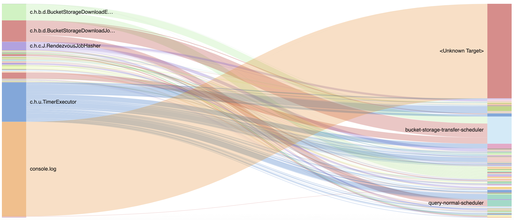 |
Figure 237. Thread Usage
Sample input data:
| action | class | thread | timestamp |
|---|---|---|---|
| processRequest | UserService | http-worker-1 | 2025-08-11T00:01:23Z |
| query | DatabaseConnector | db-pool-1 | 2025-08-11T00:01:24Z |
| processRequest | UserService | http-worker-2 | 2025-08-11T00:01:25Z |
| update | CacheManager | cache-worker | 2025-08-11T00:01:26Z |
| update | DatabaseConnector | db-pool-2 | 2025-08-11T00:01:27Z |
Query. This query prepares the data
structure and produces the input data manually instead of calling the
companion sankey() function. The output can be
directly used with the diagram, which will render the visualization
based on the source, target, and
weight fields.
rename(class, as=source)
| rename(thread, as=target)
| groupBy([source, target], function=count(as=weight))
Query breakdown:
Renames the class field to
sourceto create the source nodes (left side of diagram)Renames thread field to
targetto create the target nodes (right side of diagram).Groups by each unique class-thread combination and counts occurrences of each; the weight field determines edge thickness in the diagram.
The class and
thread fields must be renamed
as source and target to match the expected input. To produce
weight fields, make sure that
the function used in groupBy() names its result
as weight.
Configuration:
From the
Searchpage, type your query in the Query Editor → clickChoose in the Widget selector
Click the style icon : this opens the Format panel on the side where some properties are already configured by default based on the query result.
Modify some properties, such as:
Change the Colors palette from
inherittocustomto differentiate the widget from any others in this dashboard.Set Stack sorting as
labelto show the series sorted by label name.Adjust the Max length of the labels as desired (useful in case of long label text).
You can further customize this widget by setting more properties, see Sankey Property Reference.