
Network Traffic by Protocol
Analyze network traffic patterns by protocol to identify unusual data transfers or potential security risks.
Visualization: the pie chart shows proportional distribution of protocols by bandwidth consumption, making unusual traffic patterns immediately visible to security operations teams.
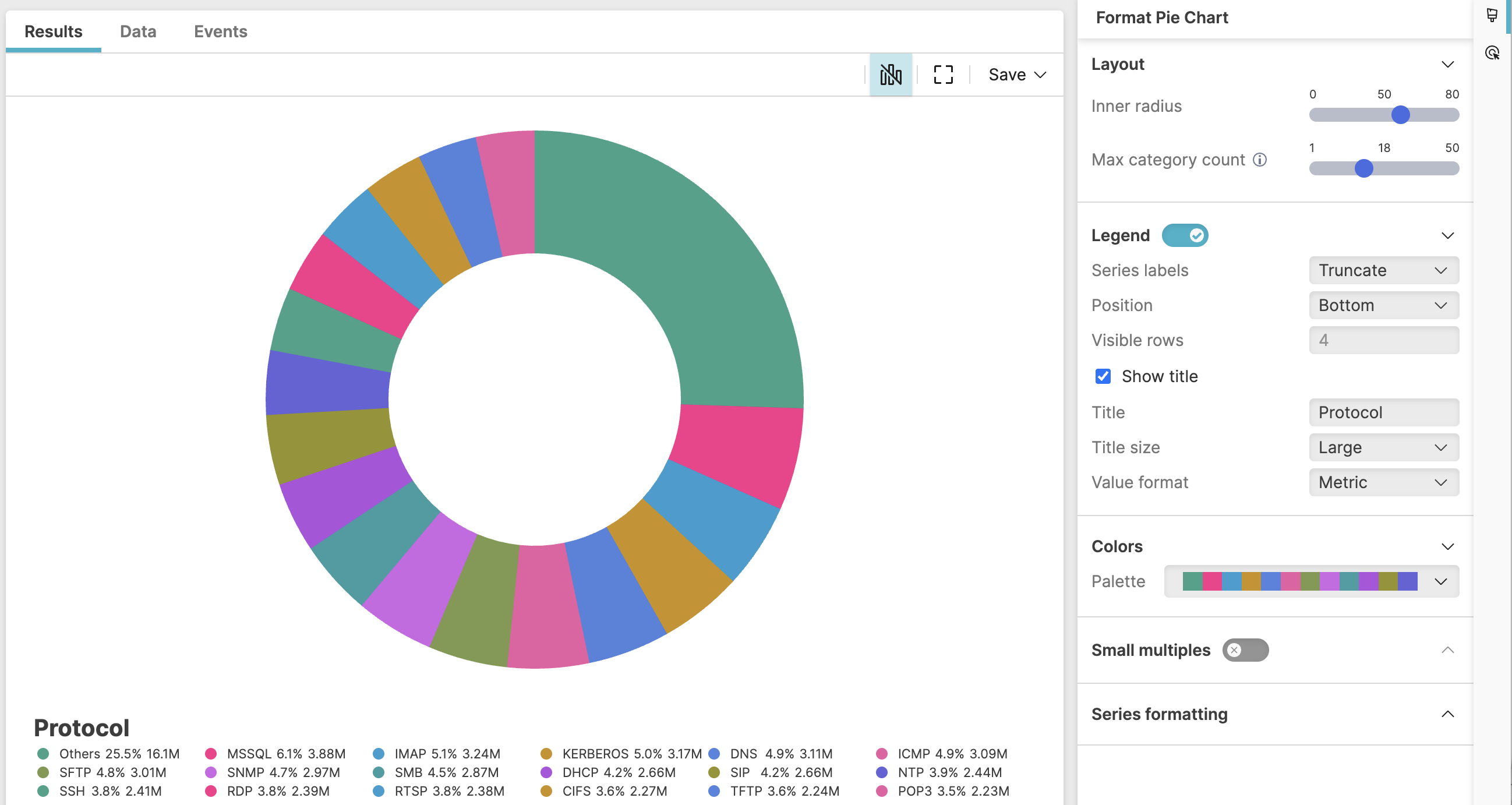 |
Figure 233. Network Traffic by Protocol
Sample input data:
| bytes | protocol | src_ip | timestamp |
|---|---|---|---|
| 15000 | HTTPS | 192.168.1.100 | 2025-08-11T00:01:23Z |
| 8000 | HTTP | 192.168.1.101 | 2025-08-11T00:01:24Z |
| 12000 | SMB | 192.168.1.102 | 2025-08-11T00:01:25Z |
| 20000 | HTTPS | 192.168.1.103 | 2025-08-11T00:01:26Z |
| 500 | DNS | 192.168.1.104 | 2025-08-11T00:01:27Z |
Query:
protocol=*
| groupBy(protocol, function=sum(bytes))
| sort(_sum, order=desc)
The query analyses network traffic distribution across protocols, identifying which protocols consume the most bandwidth.
This query is useful, for example, to identify protocols consuming excessive bandwidth, detect unusual protocol usage patterns, or monitor network traffic composition for security analysis.
Query breakdown:
Filter events to include only those where the
protocolfield exists and has a value – that is, the wildcard*matches any non-empty value.Group the data by the protocol field and calculates the aggregate sum of
bytesfor each protocol. The result is stored in a default field named _sum, which contains the total data transferred for each protocol type.Sort the results based on the _sum field in descending order (
order=desc), showing protocols with highest bandwidth consumption first.
Configuration:
From the
Searchpage, type your query in the Query Editor → clickChoose in the
Widget SelectorClick the style icon : this opens the Format panel on the side where some properties are already configured by default based on the query result.
Modify the properties to obtain the look and feel of this example widget, as follows:
Adjust Max category count: this will allow you to limit the number of slices in the pie chart, with the smaller slices grouped into one category named "Others" (the big green slice in Figure 233, “Network Traffic by Protocol”).
Toggle Legend on. If there is only one item in the chart, the legend does not show.
Set the position of the legend to
BottomSelect Show title to display the legend title, then assign the name "Protocol" to the legend title and adjust its size to
LargeKeep Value format as
Metricto ensure a metric, human-readable format display of the values in the chart, for example 2,828,299 raw bytes will show as 2.8M.Change the inherited Colors palette to one of the available custom palettes.
You can further customize this widget by setting more properties, see Pie Chart Property Reference.