
Distribution of Security Alert Severities
Understand the overall risk landscape. This chart enables you to:
Quickly identify which severity levels are most common
Understand your overall risk landscape at a glance
Prioritize response efforts based on severity distribution
Track whether critical/high severity alerts are increasing over time
Visualization: the pie chart visualizes the proportion of alerts by severity level.
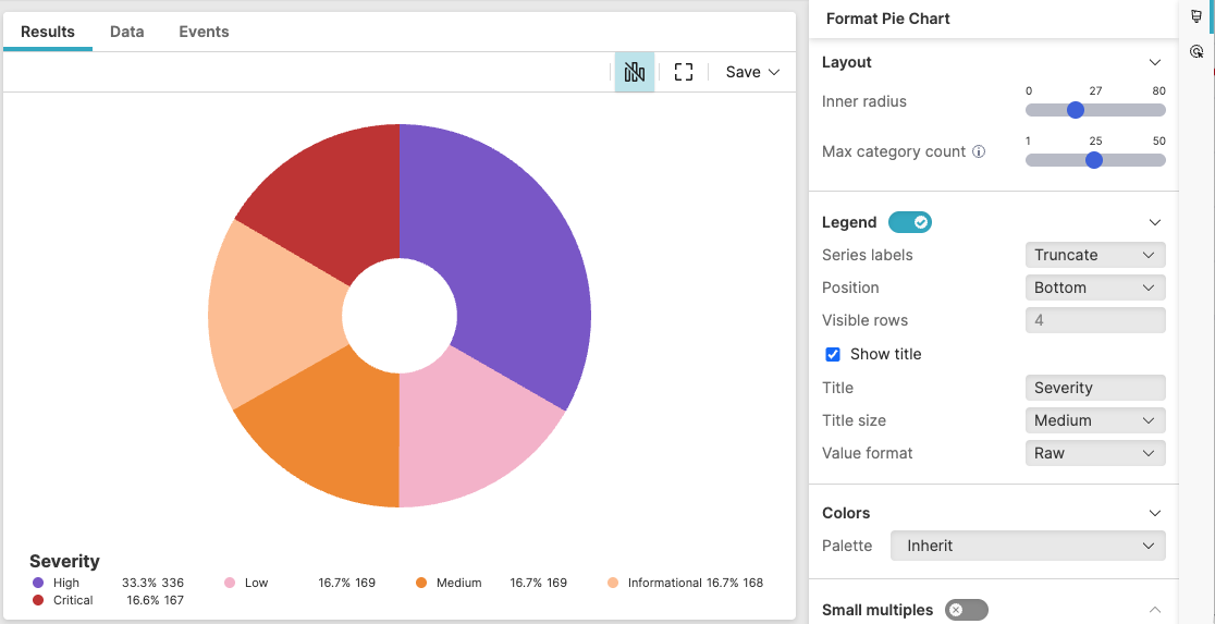 |
Figure 230. Distribution of Security Alert Severities
Sample input data:
| alert_name | host | severity | timestamp |
|---|---|---|---|
| Ransomware Detection | LAPTOP01 | Critical | 2025-08-11T00:01:23Z |
| Suspicious PowerShell | SERVER01 | High | 2025-08-11T00:01:24Z |
| Failed Login | DESKTOP02 | Medium | 2025-08-11T00:01:25Z |
| Policy Violation | LAPTOP02 | Low | 2025-08-11T00:01:26Z |
| Data Exfiltration | SERVER02 | Critical | 2025-08-11T00:01:27Z |
Query:
severity=*
| groupBy(severity, function=count())
Query breakdown:
Filter to events with non-empty severity values
Group events by unique severity levels
Count events in each severity group
Provide the numerical data for the pie slices in the _count field
Configuration:
From the
Searchpage, type your query in the Query Editor → clickChoose in the
Widget SelectorClick the style icon : this opens the Format panel on the side where some properties are already configured by default based on the query result.
Modify the properties as follows to obtain the look and feel of this example widget.
Adjust the inner radius of the donut
Toggle Legend on. If there is only one item in the chart, the legend does not show.
Set the position of the legend to
BottomSelect Show title to display the legend title, then assign the name "Severity" to the legend title and adjust its size to
Medium
See Pie Chart Property Reference for more customizations of this widget.