
Malware Types by Infection Count (In Small Multiples)
Identify the most prevalent types of malware in your environment to focus security efforts and updates. This chart would be ideal for a security operations centre (SOC) dashboard.
Visualization: the pie chart visualizes the proportion of each malware type in your environment. The small multiple option offers a different way to visualize multiple aggregate results when grouping on more than one field: in this case, each unique malware type value is a donut, each donut is labelled with the malware type name.
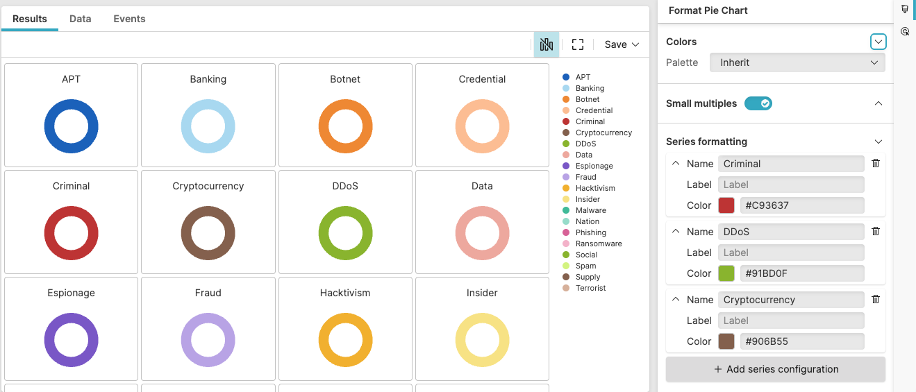 |
Figure 232. Malware Types by Infection Count
Sample input data:
| file_name | host | malware_type | timestamp |
|---|---|---|---|
| suspicious.exe | HOST01 | Trojan | 2025-08-11T00:01:23Z |
| encrypt.bin | HOST02 | Ransomware | 2025-08-11T00:01:24Z |
| logger.dll | HOST03 | Spyware | 2025-08-11T00:01:25Z |
| malicious.exe | HOST04 | Trojan | 2025-08-11T00:01:26Z |
| popup.exe | HOST05 | Adware | 2025-08-11T00:01:27Z |
Query:
malware_type=*
| groupBy(malware_type, function=count())
| sort(_count, order=desc)
Query breakdown:
Filter to include only events that have a value for the malware_type field – that is, the wildcard
*matches any non-empty value.Group all filtered malware detection events by unique values in the malware_typefield
Apply the
count()aggregate function to each groupCreate a field named _count containing the number of infection instances for each malware type
Sort the grouped results by the _count field in descending order, ensuring the most prevalent malware types appear first in the results.
Configuration:
From the
Searchpage, type your query in the Query Editor → clickChoose in the
Widget SelectorClick the style icon : this opens the Format panel on the side where some properties are already configured by default based on the query result.
Modify the properties to obtain the look and feel of this example widget, as follows:
Toggle the Small multiples option on to visualize multiple aggregate results in a grid.
In Series formatting, assign the preferred color to one or more series: for example, always show the malware type "Criminal" as red.
Set the Legend position to
Right
You can further customize this widget by setting more properties, see Pie Chart Property Reference.