
Failed and Successful Authentication Attempts
Compare failed and successful authentication attempts by department. Useful for purposes such as authentication monitoring by department, security analysis, or for identifying problematic departments.
Bar Chart type: multiple series, grouped Bar Chart.
Visualization: X-axis displays the unique combinations of department and auth_status fields, for example "success HR". Each unique combination is represented as a separate bar on the chart. Y-axis represents the count of each unique combination of the two fields. The height of each bar corresponds to the number of occurrences for that particular combination.
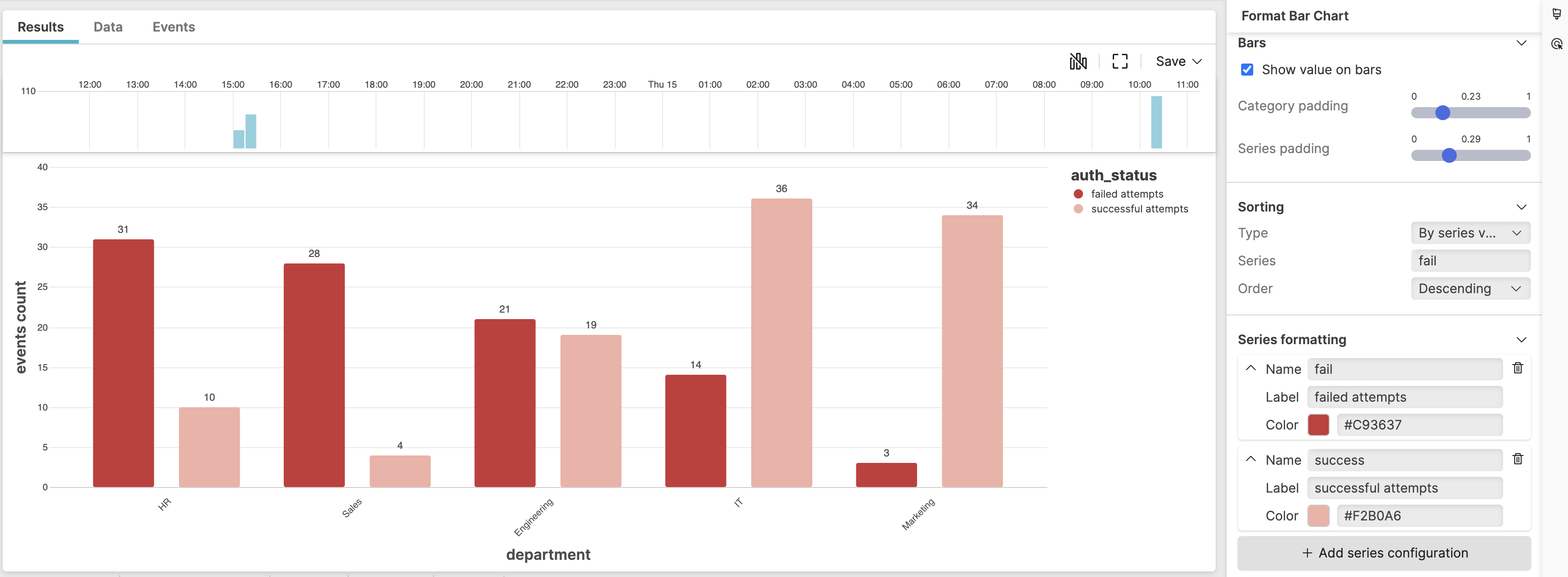 |
Figure 212. Authentication Attempts
Sample input data:
| auth_status | department | timestamp | user |
|---|---|---|---|
| success | IT | 2025-08-11T00:01:23Z | admin1 |
| failed | HR | 2025-08-11T00:01:24Z | hr_user |
| success | Sales | 2025-08-11T00:01:25Z | sales1 |
| failed | IT | 2025-08-11T00:01:26Z | tech2 |
| success | HR | 2025-08-11T00:01:27Z | hr_admin |
Query:
groupBy([department, auth_status], function=count())
| sort(department)
Query breakdown:
Group events by two fields: department and auth_status.
Count events for each unique combination, showing how many events exist for each department/auth_status pair.
Sort the results alphabetically by department name and groups all results for the same department together.
Configuration:
From the
Searchpage, type your query in the Query Editor → clickChoose in the
Widget SelectorClick the style icon : the side panel shows most settings already configured by default based on the query result. You may configure more settings manually, as follows.
Set Title formatting to
MediumSet the angle in Category axis to 45 degrees
Assign a new title "events count" in Value axis (left)
In Sorting, choose the option
By
              series value
for sorting by thefailseries: this will overlap the default sorting assigned by the query.In Series formatting, customize labels and colors of the two authentication statuses.
You can further customize this widget by setting more properties, see Bar Chart Property Reference.