
Threat Type Distribution
Visualize threat types (malware, ransomware, phishing) distribution within each time period. Useful for monitoring how the different threats evolve over time, for tracking thread volumes and visualize different threat types comparison.
Bar Chart type: multiple series, stacked bars.
Visualization: a stacked bar chart with each threat type (malware, ransomware, phishing) as a separate series over time.
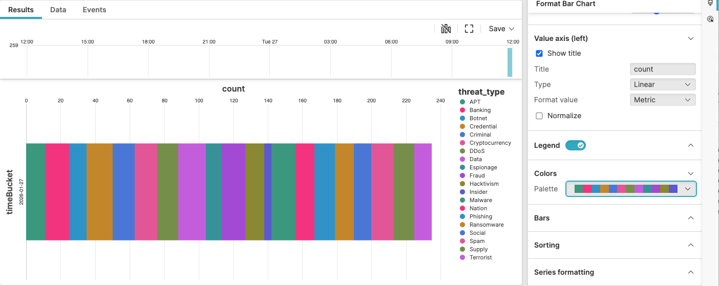 |
Figure 213. Threat Type Distribution
Sample input data:
| host | severity | threat_type | timestamp |
|---|---|---|---|
| host1 | High | Malware | 2025-08-11T00:01:23Z |
| host2 | Critical | Ransomware | 2025-08-11T00:01:24Z |
| host3 | Medium | Phishing | 2025-08-11T00:01:25Z |
| host4 | High | Malware | 2025-08-11T00:01:26Z |
| host5 | Critical | Ransomware | 2025-08-11T00:01:27Z |
Query:
threat_type=*
| timeBucket:=formatTime("%Y-%m-%d", field=@timestamp)
| groupBy([timeBucket, threat_type], limit=max)
Query breakdown:
Filter for threat events
Convert timestamp into daily buckets
Group by time bucket and threat type
You can change the format in the formatTime()
function for alternative bucket formats (hourly, weekly, monthly
buckets).
Configuration:
From the
Searchpage, type your query in the Query Editor → clickChoose in the
Widget SelectorClick the style icon : the side panel shows most settings already configured by default based on the query result. You may configure more settings manually, as follows.
In Layout, select as the type.
Check Show title for both Category axis and Value axis (left)
Toggle the Legend on, set the position of the legend to the right.
In Colors, choose a custom palette instead of that inherited from the dashboard.
You can further customize this widget by setting more properties, see Bar Chart Property Reference.