


Charting Commits in GitHub
In this scenario, you can track repository activity patterns by analyzing GitHub pull request events. This helps development teams understand project velocity and contribution patterns.
Track repository activity patterns
Identify peak contribution times
Monitor project velocity over time
Correlate pull request volume with sprint cycles
Visualization: The chart displays a single line graph showing GitHub pull request event frequency over a 30-minute period. Each data point represents the count of pull request events in a time bucket. The visualization shows activity patterns with a notable spike during periods of concentrated development work. A histogram at the top shows the event distribution across the time range. Hover over any point to see the exact event count and timestamp.
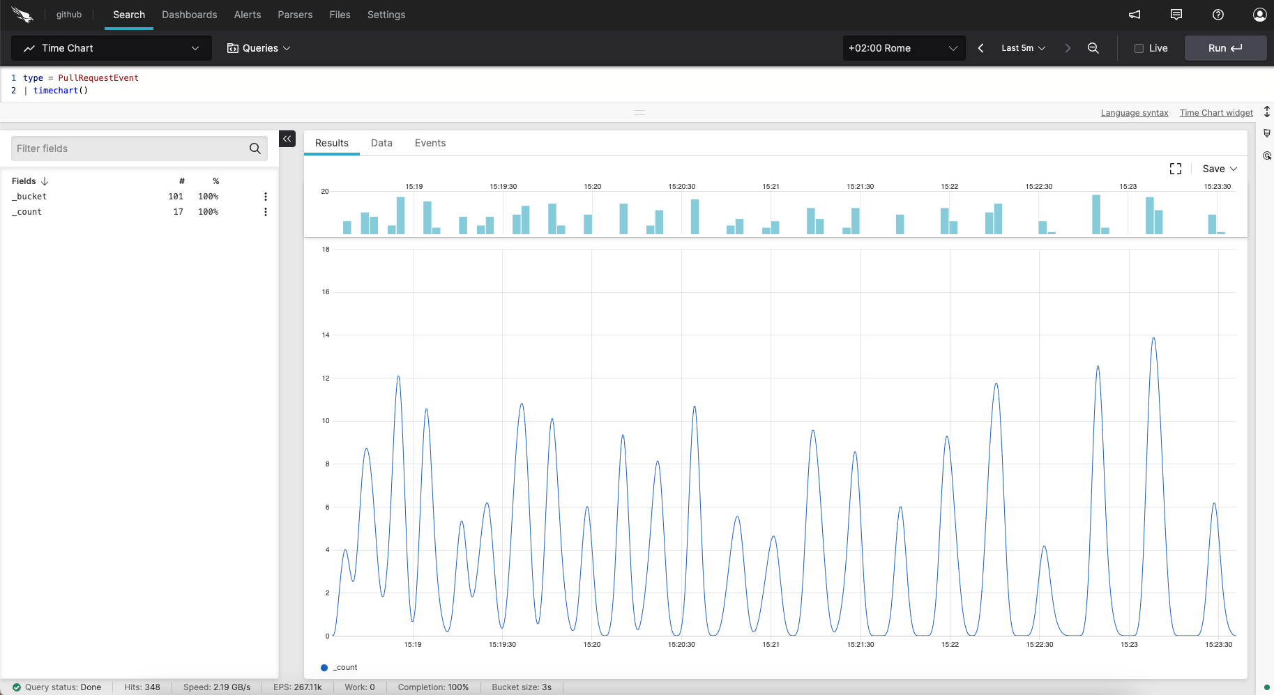 |
Figure 260. Charting Commits in GitHub
Sample input data. Here is example input data for this scenario:
| @timestamp | actor | payload | repo | type |
|---|---|---|---|---|
| 1970-01-01T00:00:02 | HASH(0x55a20735e468) | HASH(0x55a20735e150) | HASH(0x55a20735dd00) | PullRequestEvent |
| 1970-01-01T00:00:02 | HASH(0x55a207358c60) | HASH(0x55a20735e528) | HASH(0x55a20735e0a8) | PullRequestEvent |
| 1970-01-01T00:00:02 | HASH(0x55a20735e1f8) | HASH(0x55a20735e918) | HASH(0x55a207358c00) | PullRequestEvent |
| 1970-01-01T00:00:02 | HASH(0x55a20735e948) | HASH(0x55a20735e8e8) | HASH(0x55a20735dfe8) | PullRequestEvent |
| 1970-01-01T00:00:02 | HASH(0x55a207358ca8) | HASH(0x55a20735e360) | HASH(0x55a20735e270) | PullRequestEvent |
Query. To create this time chart, use the following query:
type = PullRequestEvent
| timeChart()
Query breakdown:
Filter for events with type=
PullRequestEventto select only pull request-related activities.Use the
timeChart()function without parameters to count all matching events.The function automatically buckets events by time and counts occurrences in each bucket.
Result is a single time series showing pull request event frequency over time.
Configuration:
From the
Searchpage, type your query in the Query Editor → clickChoose in the
Widget SelectorClick the style icon : the side panel shows most settings already configured by default based on the query result.
In Chart Type, the default
Lineis suitable for showing event frequency trends.In Series, configure the line color and style as preferred.
In Y-Axis:
Set Title to
Pull Request EventsKeep Scale as
LinearSet Format value to
Metric
In Time Range, adjust to show the desired time window. For concentrated activity patterns, a shorter range like
Last 30mshows detailed spikes effectively.Optionally, in Horizontal line, add a reference line by entering a Label and Y-value to mark thresholds or baseline activity levels.
You can further customize this widget by setting more properties, see Time Chart Property Reference.