
Bar Chart Examples Gallery
Each use case example in this gallery details the following:
The sample input data for the given scenario
The query needed to obtain each bar chart type
A description of the output visualization
The steps required to configure the chart
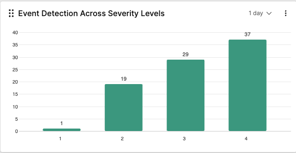 Event Detection Across Severity Levels —
Used for comparing the number of detection events across different
severity levels (Critical, High, Medium, Low).
Event Detection Across Severity Levels —
Used for comparing the number of detection events across different
severity levels (Critical, High, Medium, Low).
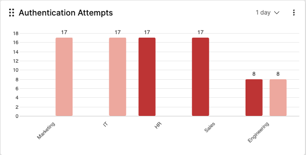 Failed and Successful Authentication Attempts
— Used for comparing failed and successful authentication
attempts by department.
Failed and Successful Authentication Attempts
— Used for comparing failed and successful authentication
attempts by department.
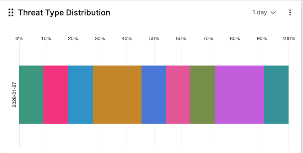 Threat Type Distribution —
Used for visualizing threat types (malware, ransomware, phishing)
distribution within each time period.
Threat Type Distribution —
Used for visualizing threat types (malware, ransomware, phishing)
distribution within each time period.
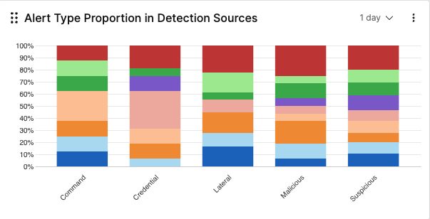 Alert Type Proportion in Detection Sources
— Used to show the relative proportion of different alert
types within each detection source.
Alert Type Proportion in Detection Sources
— Used to show the relative proportion of different alert
types within each detection source.
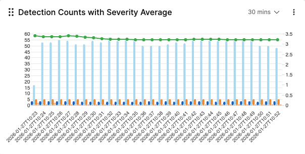 Detection Counts with Severity Average
— Used to display hourly detection counts as bars with a line
showing the moving average of detection severity.
Detection Counts with Severity Average
— Used to display hourly detection counts as bars with a line
showing the moving average of detection severity.
Click the title links on each card for step-by-step guidance on how to produce these bar charts.