
Event Detection Across Severity Levels
Compare the number of detection events across different severity levels (Critical, High, Medium, Low).
Bar Chart type: Single series.
Visualization: X-axis (category) shows the severity level (one bar per category), Y-axis shows the value (event counts) per category.
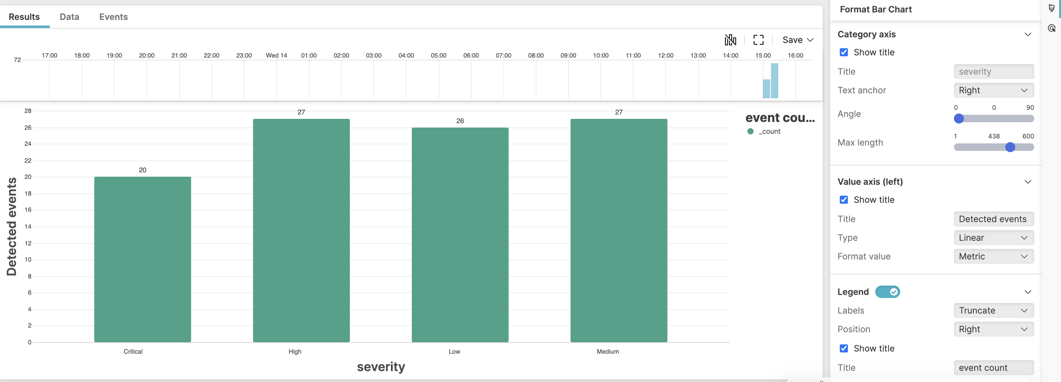 |
Figure 211. Event Detection Across Severity Levels
Sample input data:
| detection_name | host | severity | timestamp |
|---|---|---|---|
| Ransomware Activity | WORKSTATION01 | Critical | 2025-08-11T00:01:23Z |
| Suspicious PowerShell Execution | SERVER02 | High | 2025-08-11T00:01:24Z |
| Unusual Service Creation | WORKSTATION03 | Medium | 2025-08-11T00:01:25Z |
| New User Added | SERVER01 | Low | 2025-08-11T00:01:26Z |
| Credential Dumping | DC01 | Critical | 2025-08-11T00:01:27Z |
| Lateral Movement Attempt | WORKSTATION02 | High | 2025-08-11T00:01:28Z |
| Suspicious Registry Modification | SERVER03 | Medium | 2025-08-11T00:01:29Z |
| Suspicious Process Injection | WORKSTATION04 | High | 2025-08-11T00:01:30Z |
| Failed Login Attempts | SERVER04 | Low | 2025-08-11T00:01:31Z |
| Defense Evasion Attempt | DC02 | Critical | 2025-08-11T00:01:32Z |
Query:
severity=*
| groupBy(
    severity,
    function=count(),
    limit=4
  )
| sort(field=severity, order=asc)
Query breakdown:
Match all events in the selected time range.
Filter for events that contain the severity field.
Group the events by severity level.
Count how many events are in each severity group.
Sort results by count in ascending order.
Configuration:
From the
Searchpage, type your query in the Query Editor → clickChoose in the
Widget SelectorClick the style icon : the side panel shows most settings already configured by default based on the query result. You may configure more settings manually, as follows.
Set the size of Title formatting to
Largeto enlarge the title of both axesIn Category axis:
Select Show title to display the title
Customize the Title
Adjust the Text anchor to
Rightfor better display of the bar labelsRotate the bar labels by adjusting the
Angle
In Value axis (left):
Select Show title to display the title
Customize the Title
Toggle the Legend on, set the position of the legend to the right, customize the legend title, show the legend title.
Colors and Bars customize the bar appearance: set the option to show the value on bars, adjust the distance between the bars using Category padding, and choose the preferred color palette.
You can further customize this widget by setting more properties, see Bar Chart Property Reference.