
Sankey Diagram Widget
The Sankey widget is a visualization tool
that displays flow relationships between two sets of data using connected
bands or streams. The width of each band represents the proportional
volume or quantity of that flow.
For example, Figure 234, “Sankey Widget” displays "Methods vs. Protocols" where the flowing bands show how each HTTP method (source, left side) is distributed across different protocol versions (target, right side).
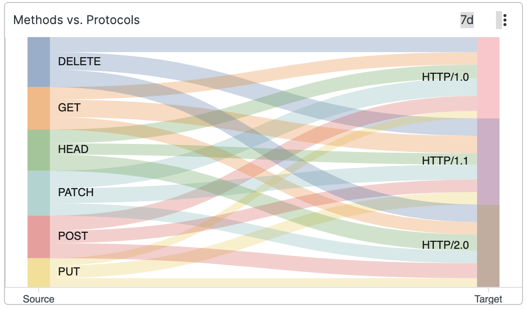 |
Figure 234. Sankey Widget
Review these sections for Sankey widget
details: