
Scatter Chart Widget
The Scatter Chart widget is a visualization
tool primarily used to investigate the correlation or relationship between
different numerical metrics in your data. It displays values as a
collection of points on a two-dimensional plane using Cartesian
coordinates, where each point represents two related values - one on the
X-axis and one on the Y-axis.
Key features:
Plots correlations between two or more numerical values
First numerical value set serves as X-axis coordinates
Subsequent value sets create different series on the Y-axis
Supports multiple series for comparative analysis.
Figure 238, “Scatter Chart” shows an example of scatter visualization:
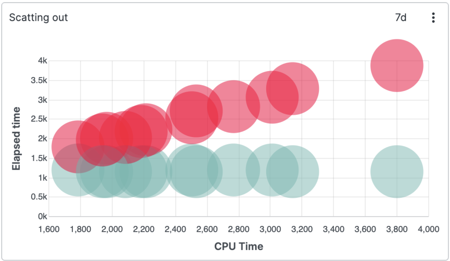 |
Figure 238. Scatter Chart
Review these sections forScatter Chart
widget details: