


Service Performance Monitoring
In this scenario, infrastructure teams can monitor global service performance for:
Response time variations across regions
Service degradation patterns
Capacity planning
Sample input data. Here is example input data for this scenario:
| datacenter_latitude | datacenter_longitude | event_simpleName | responseTime | service_name | status | timestamp |
|---|---|---|---|---|---|---|
| 40.7128 | -74.006 | ServiceHealth | 250 | payment-api | healthy | 2025-09-23T10:15:22Z |
| 51.5074 | -0.1278 | ServiceHealth | 180 | user-auth-service | healthy | 2025-09-23T10:15:23Z |
| 35.6762 | 139.6503 | ServiceHealth | 220 | product-catalog | healthy | 2025-09-23T10:15:24Z |
| -33.8688 | 151.2093 | ServiceHealth | 280 | order-processing | degraded | 2025-09-23T10:15:25Z |
| 1.3521 | 103.8198 | ServiceHealth | 320 | inventory-manager | healthy | 2025-09-23T10:15:26Z |
Query. To create a worldmap, use the following query:
event_simpleName=ServiceHealth
| parseJson()
| service_name=*
| worldMap(
    lat=datacenter_latitude,
    lon=datacenter_longitude,
    magnitude=avg(responseTime)
)
Query breakdown:
Filter for events with event_simpleName=
ServiceHealth.Use
parseJson()to extract JSON fields from the raw event data into individual fields that can be queried.Filter for events that have a service_name field.
Use the
worldMap()function withlatandlonparameters set to datacenter_latitude and datacenter_longitude, andmagnitudeset toavg(responseTime)to plot datacenters on the map sized by average response time.
Visualization: The map displays colored dots representing data centers worldwide. The size or color intensity of each marker corresponds to the average response time for that location — larger or darker markers indicate higher response times. Hover over markers to see exact metrics including datacenter location, service name, and average response time values.
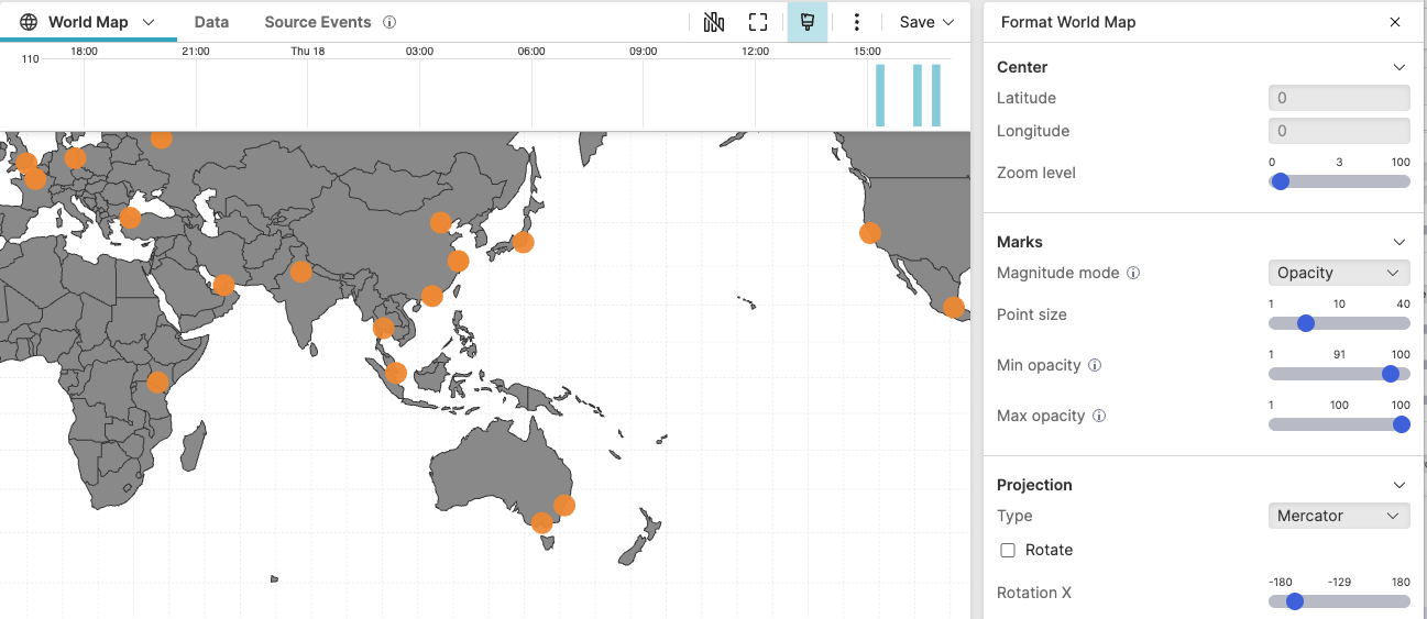 |
Figure 263. Service Performance Monitoring
Configuration:
From the
Searchpage, type your query in the Query Editor → clickChoose in the
Widget SelectorClick the style icon : the side panel shows most settings already configured by default based on the query result.
In Center, set the zoom level to show all your datacenters globally, or adjust latitude and longitude to focus on specific regions.
In Marks, set the magnitude mode to
Sizeto scale markers based on average response time. Configure Min point size and Max point size to make performance differences clearly visible across datacenters.Alternatively, set the magnitude mode to
Opacityto use marker transparency for representing response times, adjusting min opacity and max opacity as needed.Add a descriptive Title such as
Global Service Performance by
              Datacenter
.
You can further customize this widget by setting more properties, see World Map Property Reference.