
Pie Chart Usage and Data Format
You can use the Pie Chart widget to
visualize results of the groupBy() and
top() functions.
If you need to display multiple aggregate results in a single chart, you
may prefer the Bar Chart widget,
typically used to display multiple aggregate results.
As an alternative to bar charts, the Pie
Chart widget supports the
small multiples
configuration option to visualize multiple aggregate results. When
grouping on more than one field, the widget can show multiple versions
of itself in a grid — one for each value of a particular field.
For example, you can group on HTTP requests as well as status by using
the following query:
groupBy([method, status])and then display a pie chart of the status distribution for each method, using the Small multiples property:
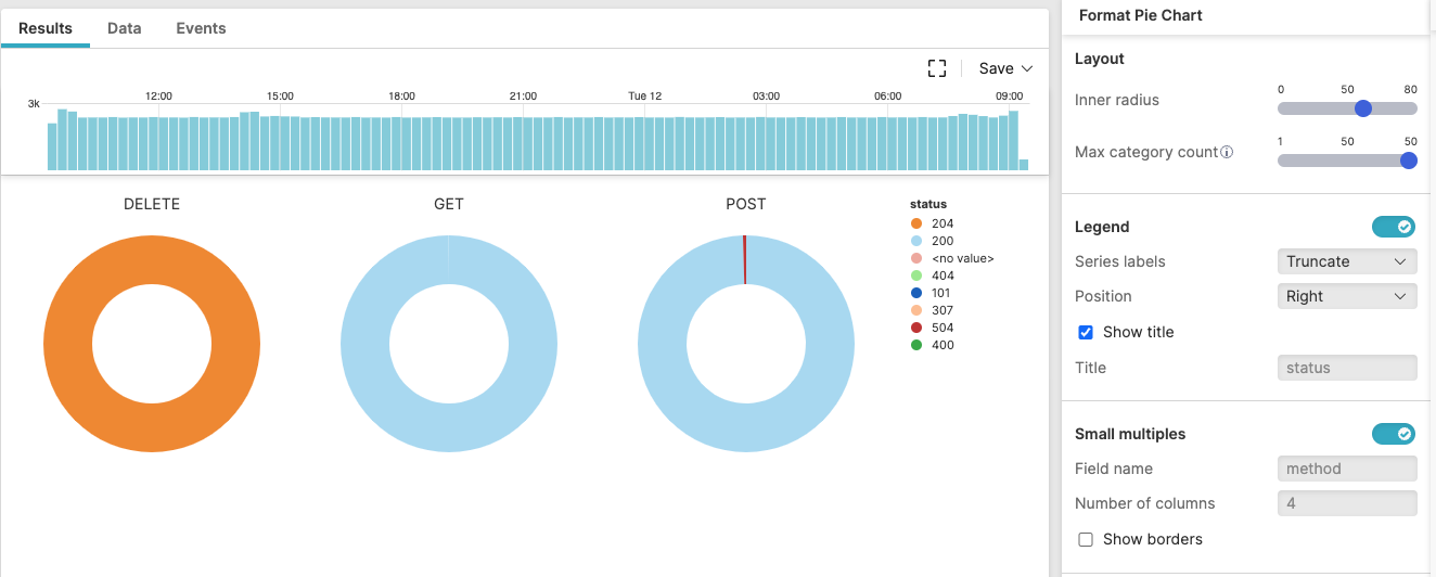 |
Figure 229. Pie Chart in Small Multiples
Malware Types by Infection Count (In Small Multiples) provides another example of pie chart visualization in small multiples.