
Detection Counts with Severity Average
Display detection counts as bars, with option to show the hourly moving average of detection severity.
Bar Chart type: Line Overlay chart.
Visualization: displays daily detection counts as bars. Option to show the hourly moving average of detection severity.
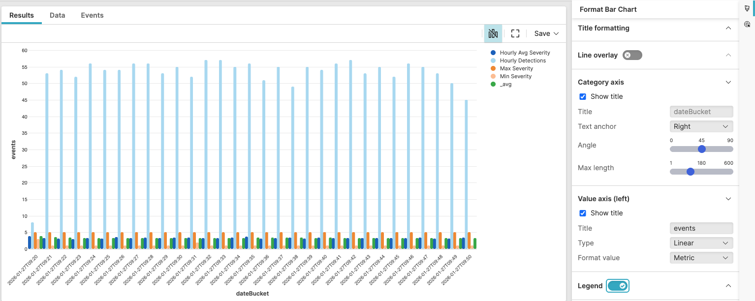 |
Figure 215. Daily Detection Counts with Severity Average
Sample input data:
| detection_id | severity_score | timestamp | type |
|---|---|---|---|
| det1 | 8 | 2025-08-11T00:01:23Z | malware |
| det2 | 5 | 2025-08-11T00:01:24Z | suspicious |
| det3 | 9 | 2025-08-11T00:01:25Z | ransomware |
| det4 | 6 | 2025-08-11T00:01:26Z | suspicious |
| det5 | 7 | 2025-08-11T00:01:27Z | malware |
Query:
detection_id=* severity_score=*
| dateBucket:=formatTime("%Y-%m-%dT%H:%M", field=@timestamp)
| groupBy(dateBucket, function=[
    count(as="Hourly Detections"),
    avg(severity_score, as="Hourly Avg Severity"),
    min(severity_score, as="Min Severity"),
    max(severity_score, as="Max Severity")
  ], limit=max)
| sort(dateBucket, order=asc, limit=10000)
| slidingWindow(avg("Hourly Avg Severity"), events=60)
Query breakdown:
Filter for detection events and ensure to only have events with severity scores
Create hourly time buckets
Group by hour with multiple aggregations
Sort chronologically (required)
Calculate hourly moving average
The chart is useful for showing both detection volume and severity trend.
Configuration:
From the
Searchpage, type your query in the Query Editor → clickChoose in the
Widget SelectorClick the style icon : the side panel shows most settings already configured by default based on the query result. You may configure more settings manually, as follows.
Enter a title, for example "events" in Value axis (left) and select the Show title checkbox
Toggle Legend on
Toggle Line overlay on to get a line showing the moving average trend by hour:
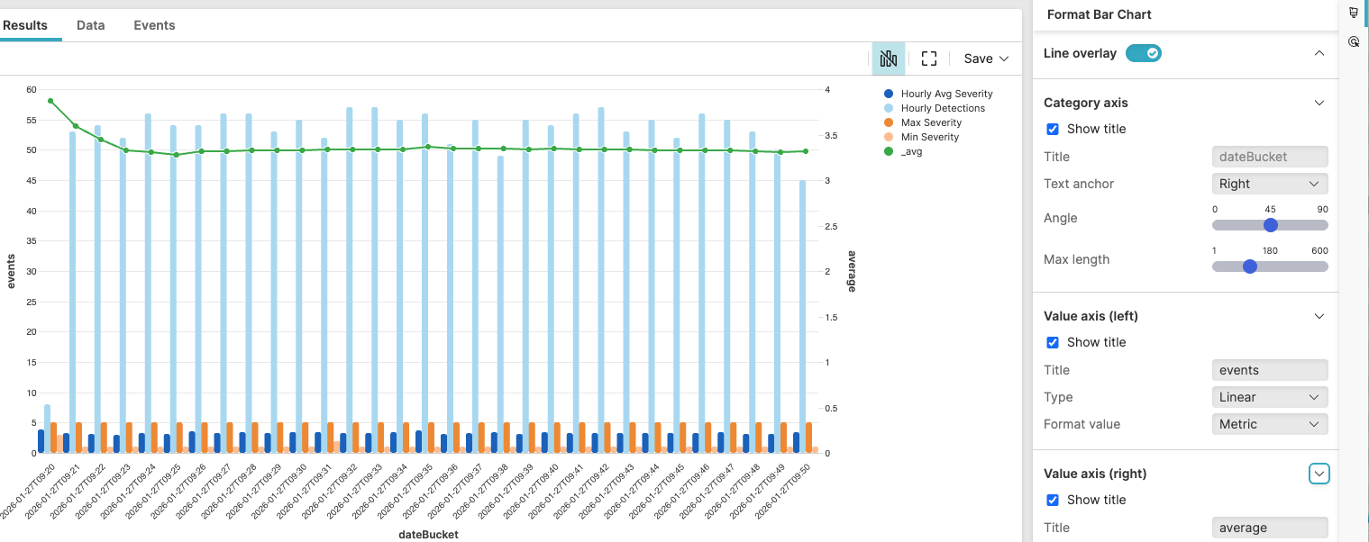
Figure 216. Daily Detection Counts with Severity Score
Under Line overlay, click the Right axis checkbox
In Value axis (right):
Select the Show title checkbox to have it displayed on the right
Change Title to "average" to clearly indicate what the line overlay is showing.
You can further customize this widget by setting more properties, see Bar Chart Property Reference.