
Widgets Gallery
The different widget types allow you to display information in different formats. Each widget type has its strengths, and choosing the right one depends on:
Type of input data being visualized
Number of variables/categories
Intended analysis goal
Dashboard space constraints
Click on each widget type for more information:
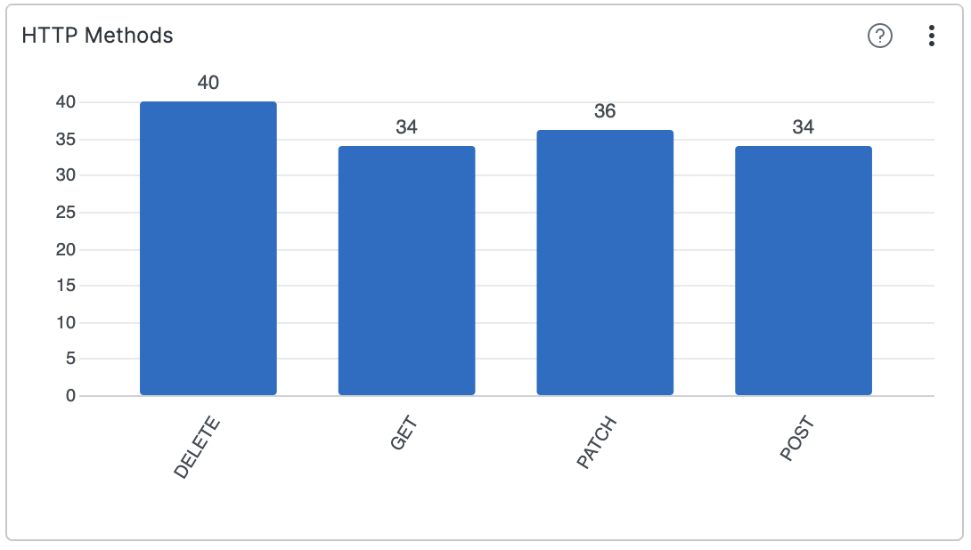
Visualizes results of the aggregated data — even results with multiple aggregates.
Displays data entries coming into LogScale. It's the default way to view data.
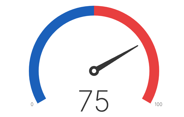
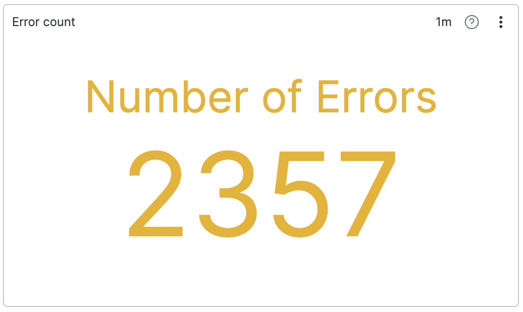
Displays a single number, a total for a search result (for instance, number of errors for day). Also supports multiple small charts — one for each field value of the aggregate query.
Displays a central variable of interest across two-axis variables.
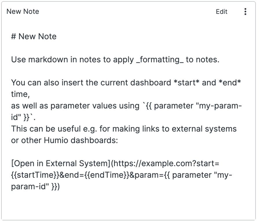
Can contain usage descriptions, user guides, and dynamic links to other systems
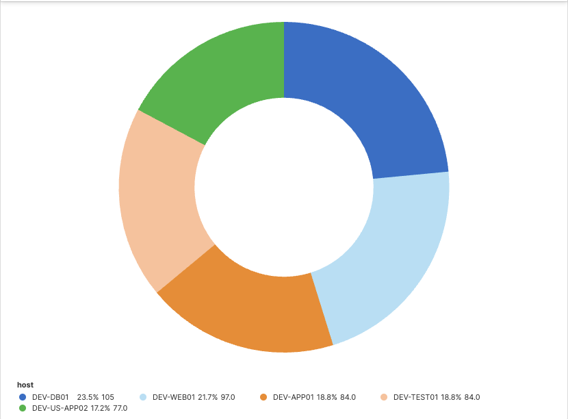
Views aggregated data and shows a visual image of the data as a whole, and proportionally for each component. When used with aggregate queries that have more than one field, also supports multiple small charts — one for each field value.
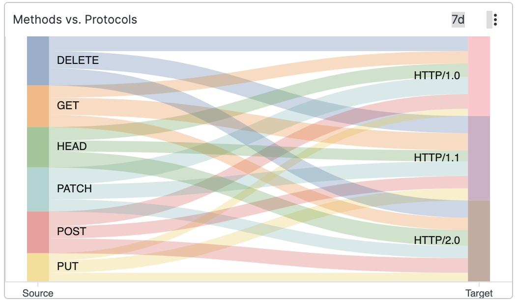
Shows results as a two-level Sankey diagram.
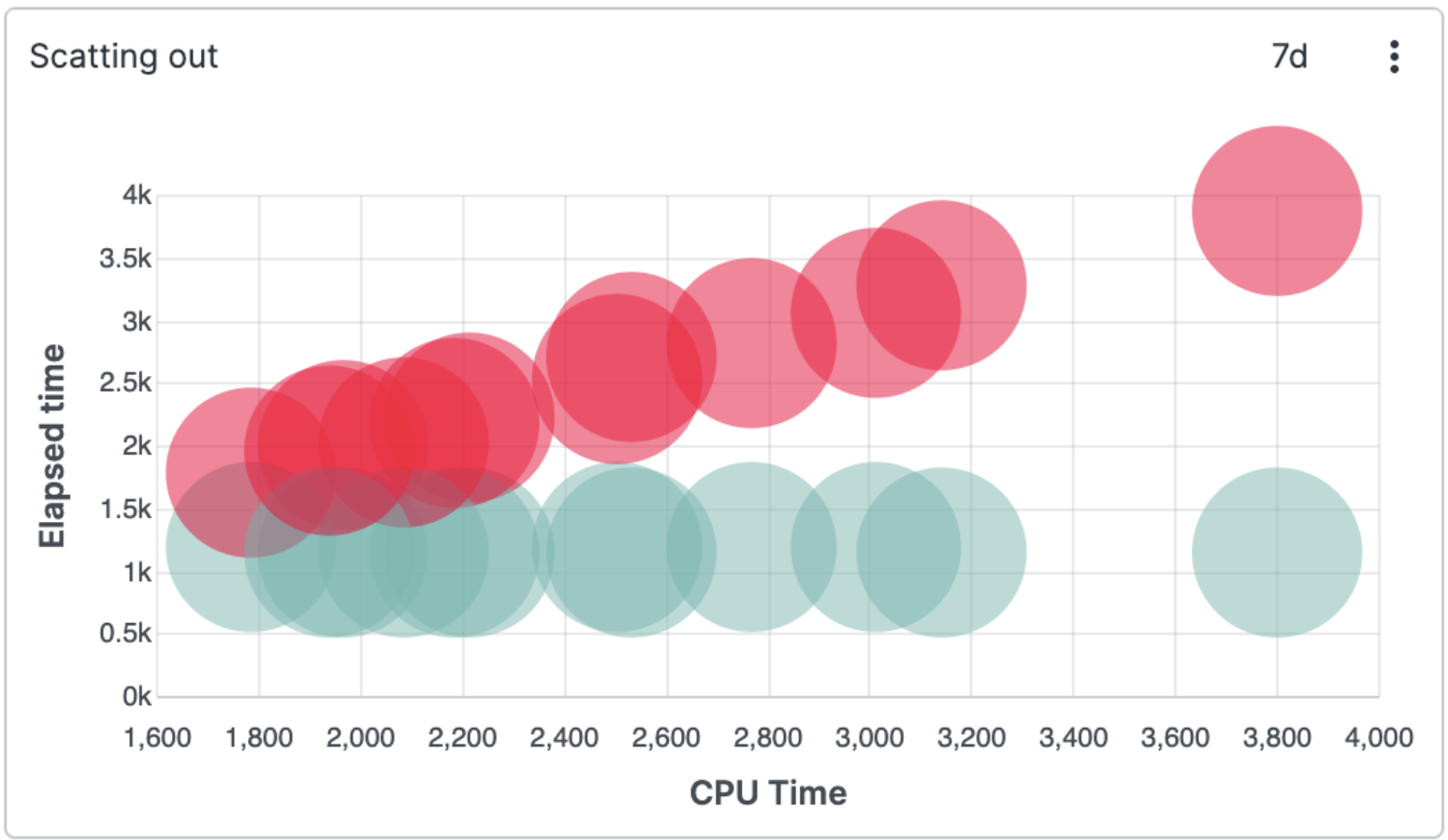
Correlates two or more sets of different numerical values.
Displays a single value as the outcome of a search result, can be a number or a non-numeric value. Also supports small multiple charts — one for each field value of the aggregate query.
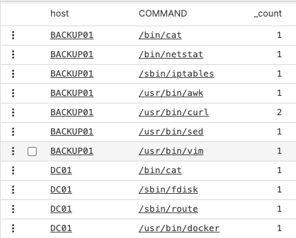
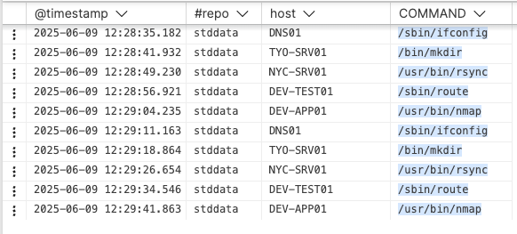
Shows the results of a search in a list with labels or field names and values for each.
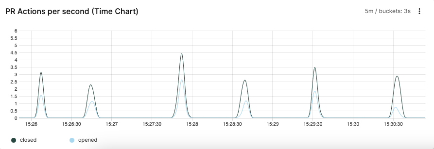
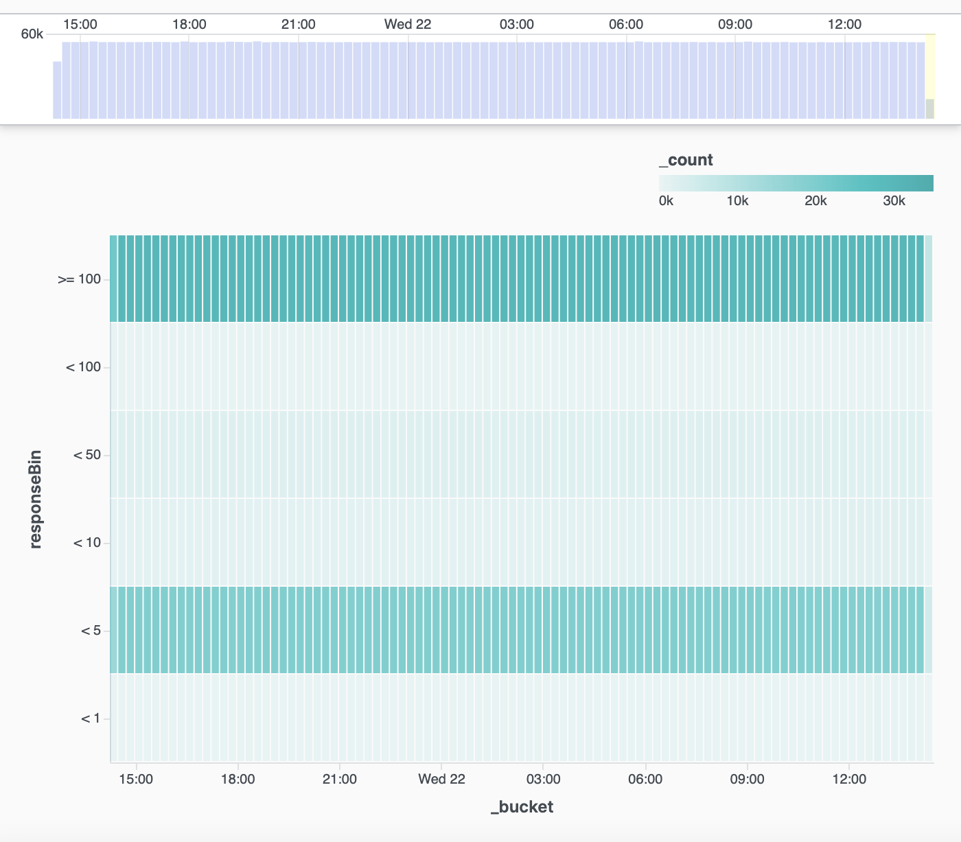
Displays time series data on a timeline. Used most frequently, working with this widget is a good skill to master when first using LogScale.
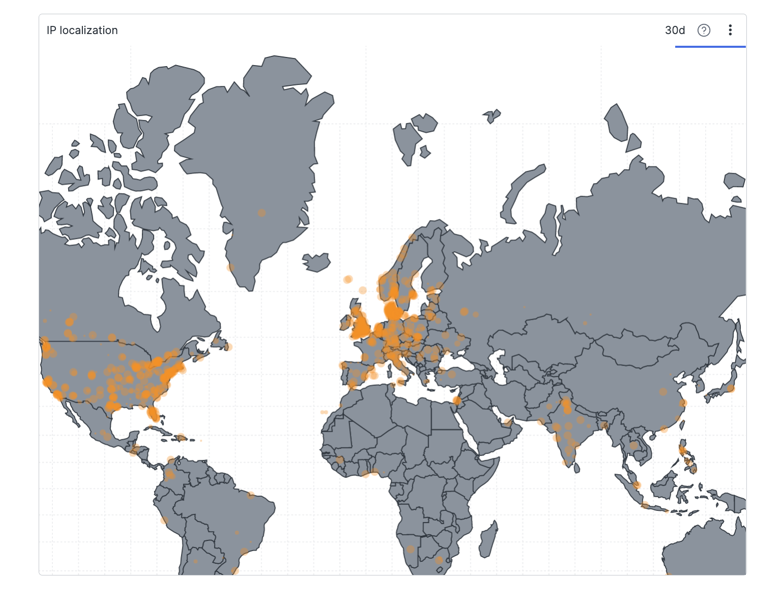
Displays a map of the world indicating values for each location.