
Alert Type Proportion in Detection Sources
Shows the relative proportion of alert types within each detection source.
Bar Chart type: multiple series - 100% stacked bars.
Visualization: a stacked bar chart with 100% normalization.
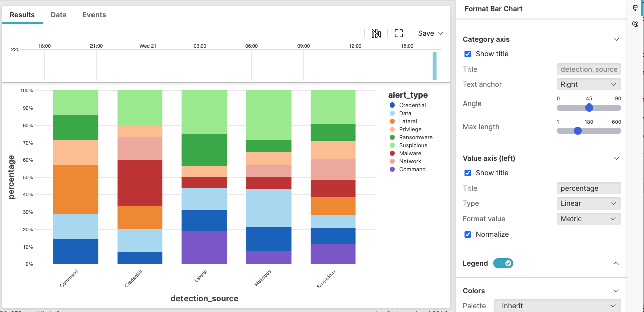 |
Figure 214. Alert Type Proportion in Detection Sources
Sample input data:
| alert_type | detection_source | host | timestamp |
|---|---|---|---|
| Process | EDR | host1 | 2025-08-11T00:01:23Z |
| Network | Firewall | host2 | 2025-08-11T00:01:24Z |
| File | EDR | host3 | 2025-08-11T00:01:25Z |
| Network | Firewall | host4 | 2025-08-11T00:01:26Z |
| Process | EDR | host5 | 2025-08-11T00:01:27Z |
Query:
detection_source=* alert_type=*
| groupBy([detection_source, alert_type], limit=max)
Query breakdown:
Filter for relevant events
Group events by two fields: detection_source and alert_type.
Count events for each unique combination
Configuration:
From the
Searchpage, type your query in the Query Editor → clickChoose in the
Widget SelectorClick the style icon : the side panel shows most settings already configured by default based on the query result. You may configure more settings manually, as follows.
In Layout, select as the type.
In Value axis (left):
Ensure that Type is set to
LinearClick the Normalize checkbox
Change Title to "percentage" to clearly indicate that the axis shows the relative proportion of the different alert types.
You can further customize this widget by setting more properties, see Bar Chart Property Reference.