
Bar Chart Widget
The Bar Chart widget represents aggregate
data values as rectangular bars. The varying bar lengths help users
identify data patterns and trends.
Bar chart visualizations excel at comparing quantities across categories or tracking changes over time units, such as weekly or monthly trends.
Figure 208, “Bar Chart” shows an example of this widget.
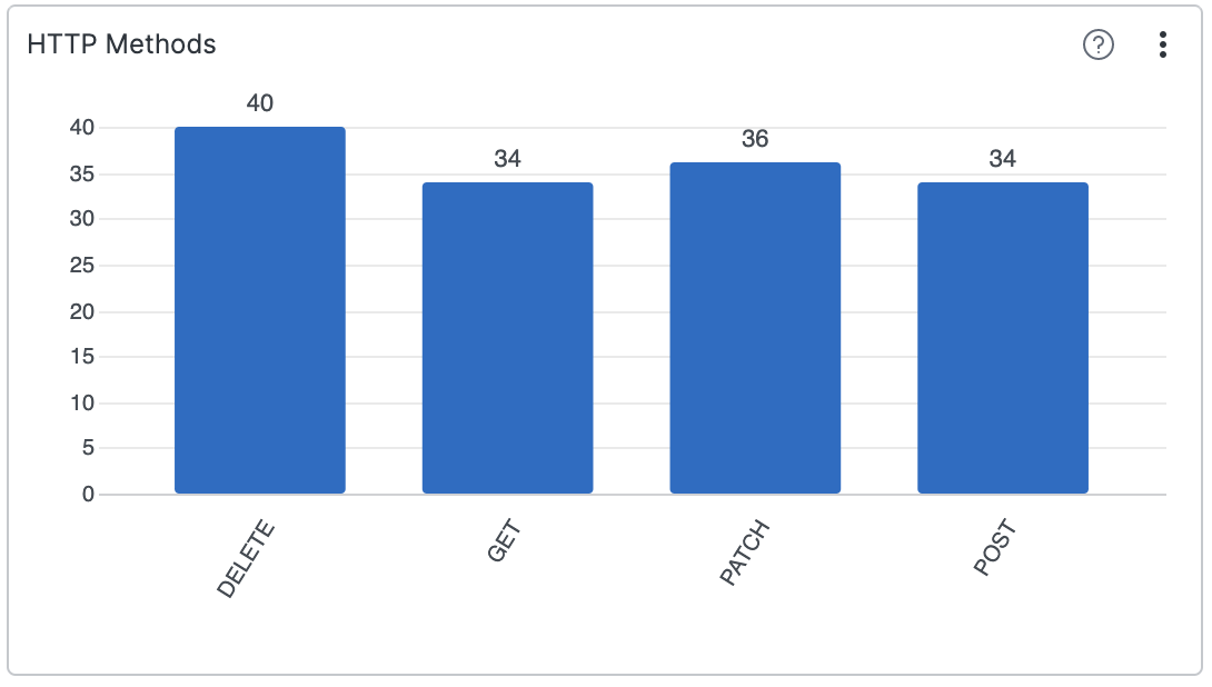 |
Figure 208. Bar Chart
Review these sections for Bar Chart widget
details: