
Time Chart Widget
The Time Chart widget is the most
commonly used widget in LogScale. It displays bucketed time series data
on a timeline.
See in Figure 220, “Time Chart” an example of how this widget may look like.
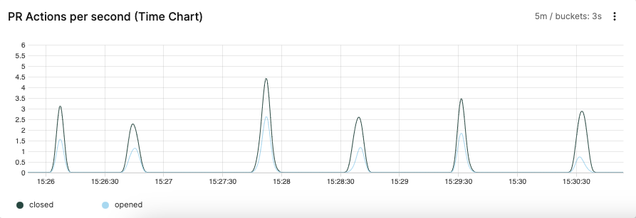 |
Figure 220. Time Chart
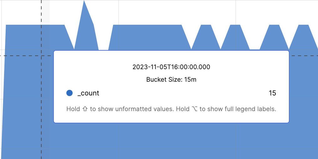
When viewing and hovering over the buckets within the
Time Chart the display will show the
precise value and time for the displayed bucket, with the time showing
the point where the bucket starts. This can be seen in the example
figure below.
 |
Input Format
The Time Chart widget expects a very
specific input format that is produced by its companion query function
timeChart(). Read more about this query function
at the timeChart() page of this documentation.
Charting Metric Data
Say you have a service that periodically writes metrics to its logs. This could be tools such as DropWizard or Micrometer or a system monitoring tool like MetricBeat.
In this case we will have JSON logs that could look something like this:
{ "type": "metrics", "id": "1", "ts": "2018-11-01T00:10:11.001", "disk0": 11.21, "disk1": 21.14, "disk2": 12.01  }
{ "type": "metrics", "id": "2", "ts": "2018-11-01T00:10:13.106", "disk0": 11.21, "disk1": 21.14, "disk2": 12.01  }
{ "type": "metrics", "id": "3", "ts": "2018-11-01T00:10:18.771", "disk0": 10.57, "disk1": 20.41, "disk2": 11.91  }
{ "type": "metrics", "id": "4", "ts": "2018-11-01T00:10:18.772", "disk0": 9.15, "disk1": 19.12, "disk2": 10.07  }
where disk0-2 represents some
metrics that you would like to create a time chart for.
type = metrics
| timeChart(function=[max(disk0, as="Disk 0"), max(disk1, as="Disk 1"), max(disk2, as="Disk 2")])
Notice that we provide several aggregate functions to the
function parameter. This is
because we want to work on several fields on each input event. In
this example it creates three series in the resulting time chart
— one for each metric. We used the max()
function on each field. This means that when the
timechart function buckets
the data it uses the larger number within the bucket to represent
the value of the series in the bucket. In other words, imagine that
event id=3 and
id=4 in JSON events above end
up in the same bucket (which is not an unreasonable assumption since
their timestamps are only 1 ms apart).
If we use max() we will get the largest value
of the field, max(disk0) of
id=3 and
id=4 would be
10.57 even though
id=4 occurs later in the
stream. Alternatively, we could have used avg()
to get the average of the two values of
disk0, in this case
9.86. Which aggregate function
to use depends on what you want to visualize.
Charting Log Levels
If you have logs that contain log levels like
INFO,
ERROR, and
WARN, it can be interesting to
visualize them over time. Say you have logs like:
2023-09-18T13:43:26.464+0000 [kafka-producer-network-thread | producer-3] WARN  o.a.k.c.p.i.Sender 42 ...
2023-09-18T13:39:28.487+0000 [timer-thread-8] ERROR c.h.b.BucketStorageUploadLatencyJob$ 43 ...
2023-09-18T13:43:04.248+0000 [timer-thread-3] INFO  c.h.u.TimerExecutor$ 41 ...
The result is a parser that extracts a field called loglevel from each line. You can do something like:
timeChart(loglevel)
This will count the number of occurrences of events that have a
field called loglevel and
put them in a series in the time chart based on their value. Based
on the example data above this would create a time chart with three
series, INFO,
ERROR and
WARN.
By default the count() function is used to
calculate the value of each bucket, but you can easily plot other
values by specifying other functions in the
function property of the
timeChart() function. For instance, if we use
the avg() function on the field
time:
timeChart(loglevel, function=avg(time))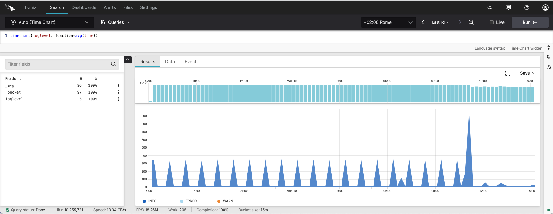 |
Figure 221. Timechart with Log Levels
We can see the average time that a database query takes. The
percentile() function is very useful as an
aggregate function in time charts when you wish to visualize
response times like this.
Charting Commits in GitHub
LogScale can access the public
github repository. From here,
we can see the number of pull requests
(type = PullRequestEvent). The
Y axis displays the total
_count, and the X access
displays the time value.
type = PullRequestEvent
| timeChart()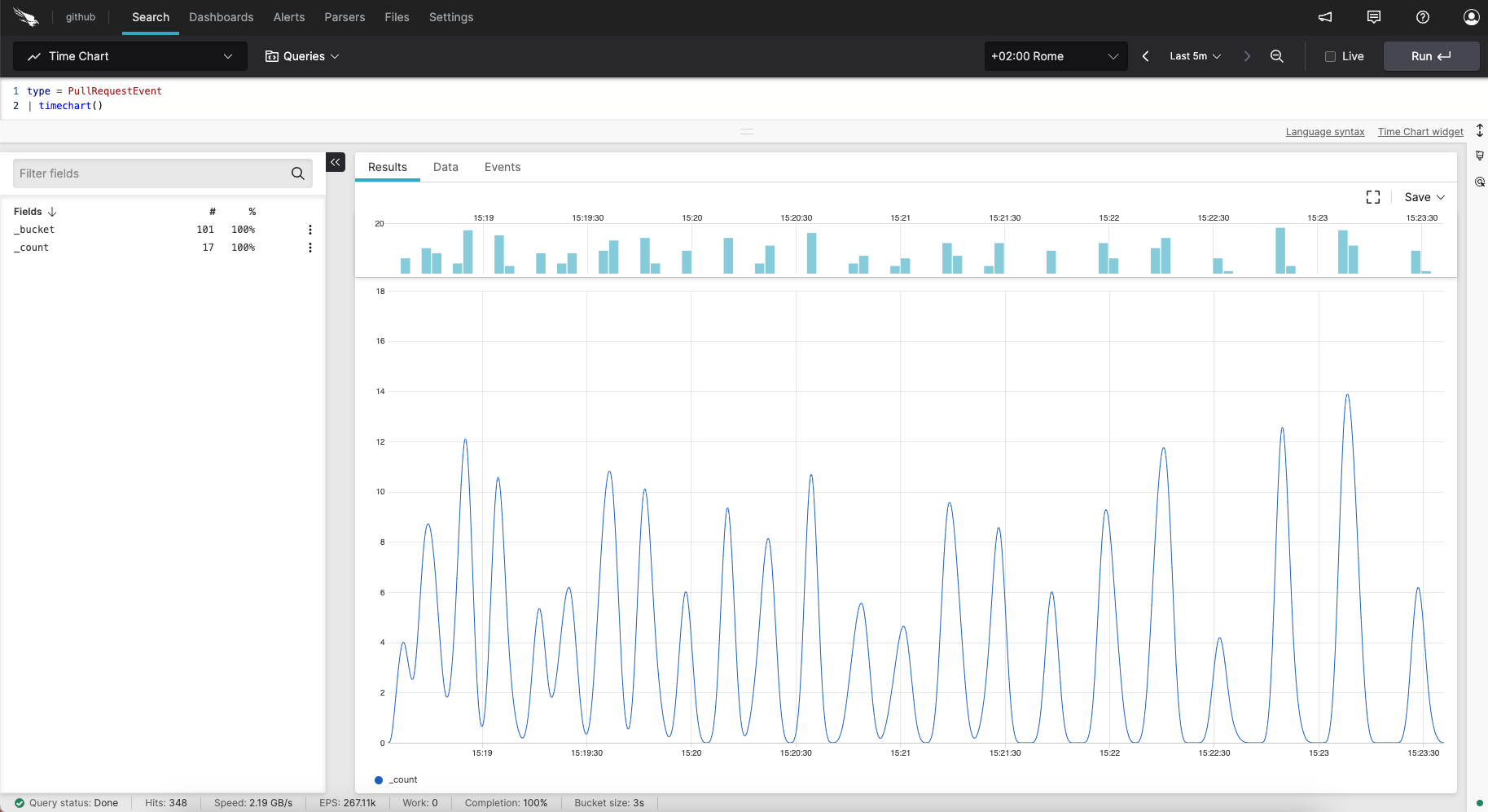 |
Figure 222. Timechart with Pulls from GitHub
Widget Properties
In the widget's side panel (Figure 155, “Widget Menu”), click the icon and the brush icon to configure the following properties.
Title
The title of the widget as displayed in the dashboard. As in the example Figure 220, “Time Chart”, it could be Errors Over Time.
Description
The description of the time chart. This is free form text supporting markdown syntax.
This same description appears in the dashboard as a tooltip by hovering over the question mark on top of the widget.
Plot
Type
This is the plot type. Valid options are:
Area— a filled line chart representation of the data.Line— a simple line plot of the data over time.
Interpolation
The interpolation method to use. Interpolation determines how the lines between the points are shown.
The lines produced by the basis and the bundle interpolation methods are not guaranteed to actually pass through the data points.
Valid options are:
Monotone— produces a smooth curve with continuous first-order derivatives that passes through any given set of data points without spurious oscillations.Linear— produces a polyline through the specified points.Step after— produces a piecewise constant function (a step function ) consisting of alternating horizontal and vertical lines. The y-value changes after the x-value.Basis— produces a cubic basis spline using the specified control points. The first and last points are triplicated such that the spline starts at the first point and ends at the last point, and is tangent to the line between the first and second points, and to the line between the penultimate and last points.Natural— produces a natural cubic spline with the second derivative of the spline set to zero at the endpoints.Cardinal— produces a cubic cardinal spline using the specified control points, with one-sided differences used for the first and last piece. The default tension is 0.Catmull-Rom— produces a Catmull-rom spline , which is a special case of the cardinal spline.Bundle— produces a straightened cubic basis spline using the specified control points, with the spline straightened according to the curve's beta, which defaults to 0.85.
Stacking
When set to
Stack, places all the series on top of each other, so that the entire graph depicts the total of all data plotted. Overall, they are useful for comparing multiple variables changing over an interval.Valid options are:
Off— disables the feature.Stack— enables the feature.Normalize— converts the value of each series to a percentage of a whole. This makes it easier to see the relative difference between quantities in each group.
Gradient Area
Applies gradient colors to the area fill.
Show Data Points
Checkbox to display data point values in the chart, represented by dots.
Max Series Count
Performs automatic roll-up of all lower series based on the cumulative sum. As the result do not include low series filtered during search (for example, when using the
limitparameter to timechart), it adds a series called Other.Show 'Others' checkbox to show/hide other series when there are more than the maximum number allowed in the chart.
Legend
Show Legend
Checkbox to show the legend in the chart.
Position
Choose where you want the legend to appear in the chart. Valid options are:
BottomRight
Labels
You have two options for displaying the labels:
Truncate— shortens the length of the series for a better visualization within the chart. It is used in case of long labels that would exceed the maximum space allowed in the chart. It is the default option. Hover the mouse over a label, then press and hold ALT to momentarily see the full series.Show full— shows the full name of the series, that is, the entire value is displayed in the label or tooltip. In case of very long labels, it might affect their visibility within the chart. Hover the mouse over a label, then press and hold ALT to momentarily see the truncated series.
Missing Values. How to handle any gaps between the logs received in the time span. Methods are:
Show gaps— show gaps for any missing values.Linear Interpolation— use linear interpolation to estimate missing values based on the nearest known values.Replace by Mean Value— use the mean value of each series to replace missing values.Replace by Zero— use '0' to replace missing values.
Trend line A line or curve that estimates the relationship between X and Y values. In some cases, a straight line is the best fit. But there might be cases where other types of line may better estimate the relationship.
Enable trend line checkbox.
Tick the box to visualize the trend line.
Type
When Enable trend line is checked, enables to set the type of regression to be visualized in the chart. Valid options are:
Linear— a straight line described by the formulay = ax +bLogarithmic—y = a + b * log(x)Exponential—y = a + e(b * x)Power—y = a * xbQuadratic—y = a + b * x + c * x2Polynomial—y = a + b * x + … + k * xorder
Bucket Behavior
Latest Bucket (Live)
Shows whether the last bucket that is currently receiving live data is shown in the chart (highlighted by a vertical yellow bar) or not. For more information on bucket, see Bucket Storage.
Valid options are:
IncludeExclude
X-Axis
X-Axis Title
Gives a title to the X-Axis.
Show UTC Time
Tick the box to show the UTC time in the chart.
Y-Axis
Title
Gives a title to the Y-Axis.
Unit (Suffix)
Sets the time unit.
Scale
Valid options are:
Linear— quantitative scales that preserve proportional differences.Logarithmic— quantitative scales particularly useful for plotting data that varies over multiple orders of magnitude.
Min Value
Max Value
Here you can enter the desired minimum or maximum values, respectively, to be displayed in the chart.
Format Value
Format the values as
Raw,AbbreviatedorMetric. For example, if the raw formatting is 1,000, abbreviated would be 1K, and metric would be 1k (1 kilo).
Horizontal Line
Draws a fixed reference line, used for example if you want to highlight a threshold in the chart associated with a certain value in the Y-axis.
Label
Gives a name to the reference line.
Y-Value
Specifies a value in the Y-axis corresponding to where the reference line should appear in the chart.
Series
Change the color of each series and assign each field the title you want to see displayed in the chart.