
Pie Chart Widget
You can use the Pie Chart widget to
display a single result at a time.
See in Figure 205, “Pie Chart” an example of how this widget may look like.
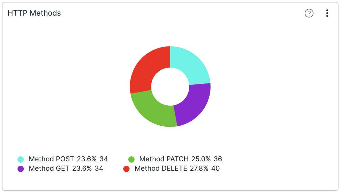 |
Figure 205. Pie Chart
Input Format
You can use the Pie Chart widget to
visualize results of the groupBy() and
top() functions.
If you want to display multiple aggregate results in a single chart,
you can use the Bar Chart widget, which
supports showing multiple aggregate results.
Or you can use the Small
Multiples option supported by Pie
Chart, see
Example: Method Distribution in Small Multiples.
Example: Log Level Distribution
Assume we have a service producing logs like the ones below.
2018-10-10T01:10:11.322Z [ERROR] Invalid User ID. errorID=2, userId=10
2018-10-10T01:10:12.172Z [WARN]  Low Disk Space.
2018-10-10T01:10:14.122Z [ERROR] Invalid User ID. errorID=2, userId=11
2018-10-10T01:10:15.312Z [ERROR] Connection Dropped. errorID=112 server=120.100.121.12
2018-10-10T01:10:16.912Z [INFO]  User Login. userId=11
We would like to show a pie chart of the relative distribution of
events with the respective log levels
INFO,
ERROR, and
WARN.
groupBy(logLevel)If there is only one item in the pie chart, then the legend will not appear.
Example: Method Distribution in Small Multiples
The Pie Chart widget supports small
multiples, which can be toggled in the settings. When grouping on
more than one field, the widget can show multiple versions of itself
in a grid — one for each value of a particular field. For
example, you can group on HTTP requests as well as status:
groupBy([method, status])and then display a pie chart of the status distribution for each method using the Small multiples property:
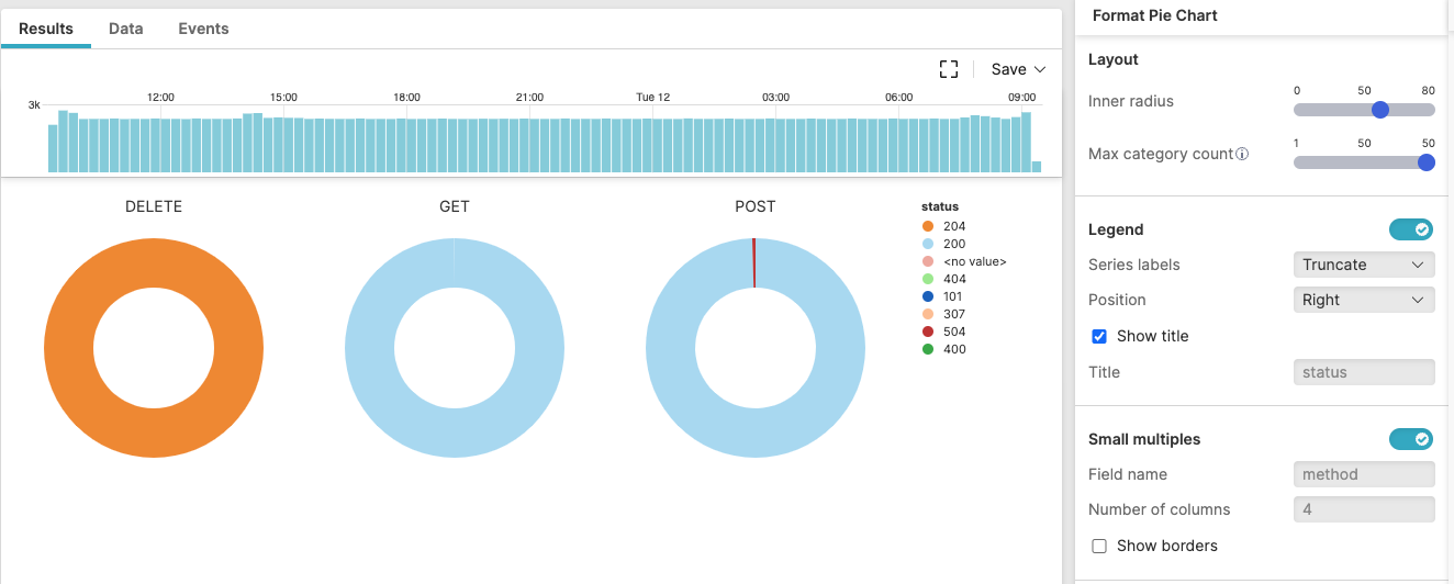 |
Figure 206. Pie Chart in Small Multiples
Widget Properties
In the widget's side panel (Figure 155, “Widget Menu”), click the icon and the brush icon to configure the following properties.
Title
The title of the widget as displayed in the dashboard. In the example Figure 205, “Pie Chart”, the chart shows all HTTP methods, except
PUTandHEAD.Description
The description of the chart. This is free form text supporting markdown syntax.
This same description appears in the dashboard as a tooltip when hovering over the question mark on top of the widget.
Layout
Inner Radius
Set the width of the inner circle of your pie. The width values are expressed in pixels.
Max Category Count
Limit the number of slices in the pie chart. The smaller slices will be grouped into the category called Other.
Legends
Labels
Valid options for displaying labels are:
Truncate— shortens the length of the series for a better visualization within the chart. It is used in case of long labels that would exceed the maximum space allowed in the chart. It is the default option. Hover the mouse over a label, then press and hold ALT to momentarily see the full series.Show full— shows the full name of the series, that is, the entire value is displayed in the label or tooltip. In case of very long labels, it might affect their visibility within the chart. Hover the mouse over a label, then press and hold ALT to momentarily see the truncated series.
Show Legend checkbox
Allows to show or hide the legend in the pie. If ticked, it prompts the following properties.
Position
Sets the position of the legend in the chart. Valid options are:
RightBottom
Visible Rows
Text field to enter the desired number of visible rows in the legend to appear.
Show Title checkbox
Allows to show or hide the legend's title.
Title
Text field to enter the desired title for the legend.
Value format
Format the values as
Raw,AbbreviatedorMetric. For example, if the raw formatting is 1,000, abbreviated would be 1K, and metric would be 1k (1 kilo).
Series
Set the color of each series and assign each field the title you want to see displayed in the chart.
Small multiples
When toggled, the query result is partitioned using the first grouping field or the specified field in the settings, and a visualization for each subresult is displayed in a grid.
Field name — name of the field used to partition the query result.
Number of columns — the number of columns in the grid. If the number of visualizations are less than the desired number of columns, the number of visualizations are used instead. If the resulting size of each visualization will be smaller than 150px, the number of columns are also overwritten by the maximum possible.
Show borders — allows to show or hide a border around each visualization.