
Bar Chart Widget
The Bar Chart widget represents aggregate
data values as rectangular bars. The varying bar lengths help users
identify data patterns and trends.
Bar chart visualization excels at comparing quantities across categories or tracking changes over time units, such as weekly or monthly trends.
Figure 197, “Bar Chart” shows an example of this widget.
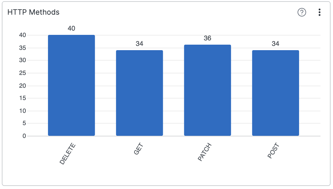 |
Figure 197. Bar Chart
Bar charts can be of two types:
Single series. Displays one data series with individual bars representing single values.
Multiple series. Displays one or more metrics per category, or one metric broken down by two dimensions. For example, by severity and vendor name.
The following use cases and variations apply.
| Bar Chart Type | Description | Use Case | Example |
|---|---|---|---|
| Single Series Bar Chart | Displays one data series with individual bars representing single values | Ideal for comparing single metrics across categories | Compare the number of detection events across different severity levels (Critical, High, Medium, Low) |
| Multiple Series - Grouped Bars | Shows multiple data series side by side for each category | Compare multiple related sub-categories simultaneously | Compare failed and successful authentication attempts by department |
| Multiple Series - Stacked Bars | Bars are stacked on top of each other, showing both individual values (and their relation to totals) and totals | Display component parts of a whole while maintaining visibility of total values | Visualize threat types (Malware, Ransomware, Phishing) distribution within each time period |
| Multiple Series - 100% Stacked Bars | Similar to stacked bars but normalized to 100% to show proportion to total | Focus on proportional distribution rather than absolute values | Show the relative proportion of different alert types within each detection source |
| Bar Chart with Line Overlay | Combines the chart with a line series to show related but different metrics | Compare volume metrics against trend indicators or averages | Display daily detection counts as bars with a line showing the 7-day moving average of detection severity |
Input Data Mapping
The Bar Chart widget maps fields based
on the query result as the default behavior. This behavior can be
overwritten by manually mapping from fields in the query result to
visual properties, using the Data Mapping property.
For example, the default mapping assigns the first field from a
groupBy() query to the category axis. When
multiple fields define the category axis, the chart creates a category
for each unique value combination.
The Series definition property configures the chart to create multiple series from a single data table, with the following options:
With the default
Automode, the chart interprets query results to select eitherFieldsmode orField valuesmode.The chart activates
Field valuesmode when the query contains multiple group fields, as ingroupBy([a,b]).In all other cases, the chart operates on
Fieldsmode.
In Field values mode, the chart creates a series name
for the unique value of a field column. A secondary column determines
the series values. When multiple fields define the series names, the
chart creates a series for each unique value combination. Example:
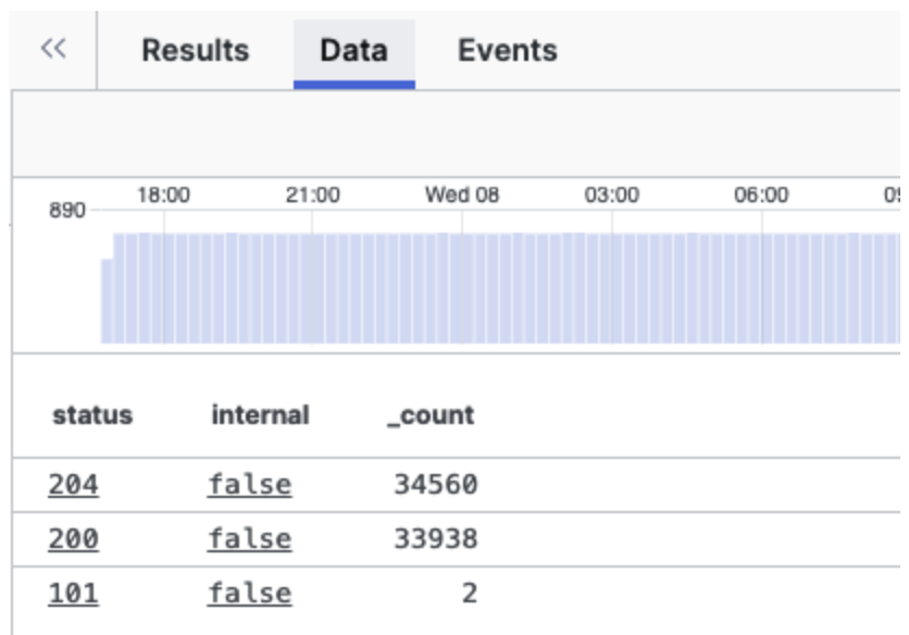 |
Figure 198. Field Values Mode View
In Fields mode, the chart creates a series from each
field column. The field name (column header) becomes the series name,
and the corresponding field values (cell values) become the series
values. Example:
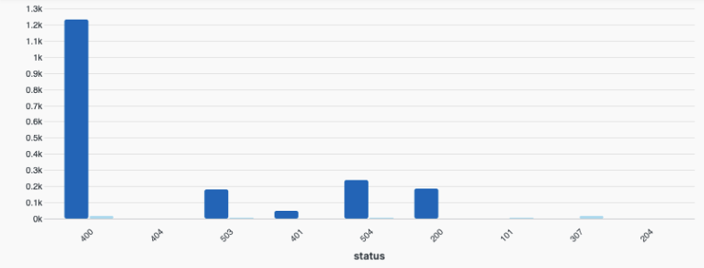 |
Figure 199. Fields Mode View
Widget Properties
In the widget side panel (Figure 159, “Widget Menu”), click the icon to configure the following properties.
General properties:
Title
The title of the widget as displayed in the dashboard. As in the example Figure 197, “Bar Chart”, it could be HTTP Methods.
Description
The description of the bar chart. This is free form text supporting markdown syntax. For example, This chart shows all HTTP methods, except
PUTandHEAD.This same description will appear in the dashboard as a tool-tip by hovering over the question mark on top of the widget.
Default time properties. The default widget time only works when Shared time is toggled off by default. Save the dashboard to set the current time selection as the default.
Time
Start
End
In the widget side panel (Figure 159, “Widget Menu”), click the brush icon to configure the following properties.
Layout
Type
Grouped— places series next to each other on a group for each categoryStacked— places series on top of each other for each category
Orientation sets the bars orientation as:
VerticalHorizontal
Data Mapping
Category displays values from the mapped field (column) by creating a category for each unique value in this column. If multiple fields define the category, the chart creates a category for each unique value combination. If left empty, the chart automatically selects the category field from the query result.
Series definition sets how series are created from the data. Valid options include:
Autoanalyzes the query result to determine the series definition.FieldsEach series is defined by a field (column) where the column header is the series name and the cell values are the series values.Field valuescreates series names from the value of a field (column) and a secondary column defines the series values. When multiple fields define the series, the chart creates a series for each unique value combination.
Series The fields used to generate series. The interpretation depends on the series definition.
Value When Series definition is set to
Field values, this field defines the series values.Max series (bars) limits the number of series shown in a category. Series with the lowest cumulative sum across categories are grouped into one series called "Other".
Line overlay
Optionally adds a line overlay in the chart. Some properties in this section vary based on the Series definition selection.
Series allows selecting the field series to be displayed as lines. Only applies when Series definition is
Fields.Value is the field that defines a secondary metric used to generate lines. Only applies when Series definition is
Field values.Right axis adds a separate axis on the right for the line marks. When this option is cleared, the chart uses the left axis to display both bar and line values.
Category axis
Show title checkbox to show the title for the category (horizontal) axis.
Title gives a title to the vertical axis.
Text anchor controls where the labels are positioned under each bar. Valid options are:
Leftwill bring labels closer to the bars.CenterRightAngle
Modifies the angle of the label displayed under each bar.
Max length
Sets the space (in pixels) between labels and the widget's bottom edge. Increasing this value reduces the graph's size.
Value axis (left)
Show title shows the title chosen for the value axis on the left.
Title gives a title to the value axis.
Type The scale type for the axis. Valid options are:
Linear— a quantitative scale that preserve proportional differences.Logarithmic— a nonlinear quantitative scale particularly useful for plotting data that varies over multiple orders of magnitude.
Normalize checkbox — only available in stacked charts with Value axis set to
Linear, allows for data normalization.
Value axis (right) This section only applies and is visible in the UI when Line overlay has been configured to have a right axis.
Show title shows the title chosen for the value axis on the right.
Title gives a title to the value axis.
Type The scale type for the axis. Valid options are:
Linear— a quantitative scale that preserves proportional differences.Logarithmic— a nonlinear quantitative scale particularly useful for plotting data that varies over multiple orders of magnitude.
Legend toggle which allows showing or hiding the legend in the chart. If selected, it prompts the following properties:
Labels Valid options are:
Truncate— shortens the length of the series for a better visualization within the chart. It is used in case of long labels that would exceed the maximum space allowed in the chart. It is the default option. Hover the mouse over a label, then press and hold ALT to momentarily see the full series.Show full— shows the full name of the series, that is, the entire value is displayed in the label or tool-tip. In case of very long labels, it might affect their visibility within the chart. Hover the mouse over a label, then press and hold ALT to momentarily see the truncated series.
Position sets the position of the legend in the chart. Valid options are:
RightBottom
Show Title checkbox
Allows to show or hide the legend's title.
Title
Text field to enter the desired title for the legend when Show Title is ticked.
Bars
Show value on bars shows the given value for each bar.
Category padding
Use this setting to control the distance between categories in the chart.
Series padding
Use this setting to control the distance between bars within a category.
Sorting
The default sorting is by X axis labels.
Order by series
Specifies the name of the field to order the series by.
Order orders the series names alphabetically.
Valid options are:
AscendingDescending
Series
Change the color of the bar series and assign them the title you want to see displayed in the chart.