
Sankey Diagram Widget
The Sankey widget can render results as a
two-level Sankey diagram. It is good at displaying flows between
entities, such as network flows from one IP to another.
The Sankey widget can also be triggered
by calling the sankey() function.
See in Figure 174, “Sankey Widget” an example of how this widget may look like.
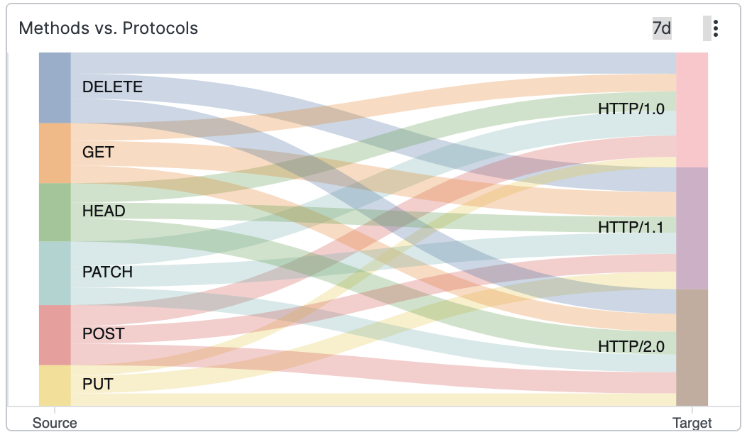 |
Figure 174. Sankey Widget
Input Format
The table below defines the required fields in incoming events for use
with a Sankey widget.
| Field | Type | Description |
|---|---|---|
| source | string | The ID of the source node (left side). This value will also be used as the label of the node. |
| target | string | The ID of the target node (right side). This value will also be used as the label of the node. |
| weight | number | The value that is used to determine the size of the edge between source and target, scaled automatically. This could be used to represent the traffic between two IP addresses. |
The Sankey widget is most easily used with its companion query
function sankey(), but can easily be used simply
by ensuring the input fields are named as expected.
Sankey Example 1: Network Traffic
Here we are using the companion query function to visualize data
flowing from src_ip to
dst_ip. We use the
sum() function to calculate the total number of
bytes sent — where
pkt_size is a field
containing the packet size.
sankey(source=src_ip, target=dst_ip, weight=sum(pkt_size))Sankey Example 2: Thread Usage
In some situations it might be easier to produce the input data manually instead of using the companion function.
rename(class, as=source)
| rename(thread, as=target)
| groupBy([source, target], function=count(as=weight))
In this case we want to visualize which classes use which threads in
a service. We need to rename the
class and
thread fields to match the
expected input; we do this using the groupBy()
function, and to produce
weight fields, we make sure
that the function we use in the groupBy() names
its result weight.
Widget Properties
Use the widget's panel to configure the following properties.
Title
The title of the widget as displayed in the dashboard.
Description
The description of the time chart. This is free form text supporting markdown syntax.
This same description appears in the dashboard as a tooltip by hovering over the question mark on top of the widget.
Axes
Show Y-axis
Shows values in the vertical axis.
Stack Sorting
Controls the order of the series in each stack.
Type arranges series by:
Label— sort by the series label name.Size— sort by the series size.
Order
Arranges series by ascending or descending order (alphabetical if sorted by label, numerical if sorted by size).
Valid options are:
AscendingDescending
Labels
Label position
Choose where you want the labels to appear in the chart. Valid options are:
Inside— positions the labels within the chart area.Outside— positions the labels external to the chart area.
Max Length
Sets the length of the label — smaller values will show labels as truncated.
Series
Allows to change the color and the displayed name of each series in the diagram.