
Table Widget
The Table widget displays data in rows
and columns.
Key features are:
Conditional formatting of table cells
Text wrapping and column resizing
Row numbering
Number formatting
Link formatting
Columns hiding
This widget is best used with aggregate functions like
groupBy() or table() for
output that has a predefined number of fields; for example, a table that
displays HTTP GET methods and their response
time.
The table() function displays data in the order
provided by the query, and the Table
widget allows to additionally format the information sorted by the
function.
See in Figure 170, “Table Chart” an example of how this widget looks like.
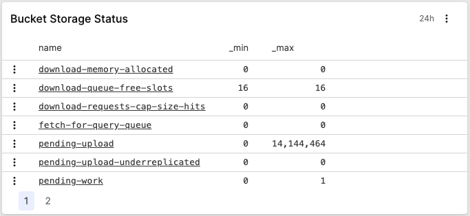 |
Figure 170. Table Chart
Input Format and Example Query
Assume we have a service producing logs like the ones below:
2018-10-10T01:10:11.322Z [ERROR] Invalid User ID. errorID=2, userId=10
2018-10-10T01:10:12.172Z [WARN]  Low Disk Space.
2018-10-10T01:10:14.122Z [ERROR] Invalid User ID. errorID=2, userId=11
2018-10-10T01:10:15.312Z [ERROR] Connection Dropped. errorID=112 server=120.100.121.12
2018-10-10T01:10:16.912Z [INFO]  User Login. userId=11
To figure out which errors occur most often and show them in a table on one of the dashboards, a query like this can be used:
loglevel = ERROR
| groupBy(errorID, function=[count(as=Count), collect(message)])
| rename(errorID, as="Error ID")
| table(["Error ID", message])
What this query will do is:
count the number of errors bucketed by their errorId
show a human readable message in the table and not just the ID by using the
collect()function, to ensure that the value of the message field makes it through the groupBy phase — which otherwise only includes the series field (errorId) and the result of the aggregate function (count().rename the errorID field to Error ID as this will be the header in the table.
ensure the order of the columns by using the
table()function.
You can customize your widget by changing its formatting: see Table Widget Properties.
For details on how to create Table
widgets, see
Creating Table Chart Widgets.
Table Widget Properties
From the widget menu (see Figure 121, “Widget Menu”) click to set:
Title
The title of the widget as displayed in the dashboard.
Description
The description of the table. This is free form text supporting markdown syntax. The description appears in the dashboard as a tooltip when hovering over the question mark on top of the widget.
Click to configure the widget's properties (find some Styling panel examples at Creating Table Chart Widgets):
General contains settings that apply to the entire table.
Text overflow allows you to control how the content is displayed when it exceeds the available space within a cell (for example, cells with @rawstring values). Available options:
ensures that the text content automatically adjusts its layout to fit the column width. This is especially useful for displaying long text and avoiding horizontal scrolling.
truncates multiline text content in a cell so that each line is shortened to fit the available space.
renders the text as one line and truncates overflowing text.
Show row numbers displays row numbers in the table.
Columns lists all table's columns — select a column to edit its properties. Click the show/hide icon next to each column to toggle its visibility in the table. Hiding the column does not remove it from the query result, which means that the column is still available for export and can be referenced in the Template Language used for interactions.
Formatting sets the formatting for the selected column.
Show as:
shows the value as is. This setting will remove any existing links from the cell.
makes the value into a link. Can be used for cases where the query contains a URL, and you want all URLs listed in the table to be linkable. Only URLs appearing in queries with the markdown style e.g.
[CrowdStrike](https://crowdstrike.com)are automatically rendered as links in the table columns. To explicitly show a plain URL or any other content as a link, use this formatting. For an example, see Add Temporary Events and URLs.. Triggers filter query with events matching the field value, meaning you can link the value to the corresponding event in the Event List. This is the default behavior for grouping fields returned by functions like
groupBy()ortop(). For an example, see Display Different Statuses.
Format as:
. Only applicable to number values, formats the data in bytes (B), kilobytes (kB), megabytes (MB), gigabytes (GB), etc. Example: number
1500000will be displayed as1.5 MB.sets the appearance of number values:
Decimal places rounds the value to the number of decimal points.
displays numbers with thousand separators. Example:
3,728.24.
shows value as is, no formatting applied.
. Only applicable to number values, converts Unix timestamp with milliseconds in "Time ago" relative time. Example:
1y 60d 10h ago.. Only applicable to number values, interprets number values as milliseconds and displays the milliseconds elapsed as duration. Example:
12ms.. Only applicable to number values, interprets number values as milliseconds and formats cell values as timestamps. Example:
yyyy-mm-dd hh:mi:ss
Size — controls size's adjustments to the column. Options are:
Fit to data — automatically adjusts column width to fit the data. This will ignore any Text overflow settings for this column.
Custom width — sets a static width of the column.
Cell colors sets the background color of cells in a column.
Type options are:
sets a static background color (or no color is set).
allows to configure thresholds and to choose a predefined palette of colors (can be diverging colors or monochrome with different nuances) automatically assigned to thresholds. For example, light green applied to all values below 50, dark green for all above 100. You can modify the color for any threshold: this will turn the palette to a Custom palette. Multiple thresholds are supported. For an example, see Figure 172, “Properties Panel - Example 1”.
allows to assign a color to a value cell when a condition you have defined for that value is met. For example, all values in HTTP status column that contain
04must be displayed in red. Multiple conditions are supported. For an example, see Figure 174, “Properties Panel - Example 2”.You can set the following conditions:
equals
not equals
contains
not contains
starts with
ends with
is present
is not present — this is a special condition that allows to set a color for empty cells (where
no valueis shown).
Creating Table Chart Widgets
The procedure for creating Table
widgets is described in the examples that follow.
Display Different Statuses — a table that counts events for the different HTTP methods.
Add Temporary Events and URLs — a table that shows information and reference URLs for each field.
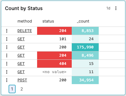
Display Different Statuses
You want a table that counts events for the different HTTP methods, which have registered HTTP status errors, like this:
|
Figure 171. Count by Status
From the
Searchtab, type this query in the Query Editor:logscalegroupby([method, status])A table is created that has fields method, status and _count as its columns.
Save your widget as explained at Create from a Query
Click the menu icon on top-right of the widget and select , the Styling panel is displayed:
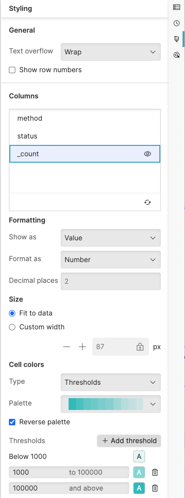
Figure 172. Properties Panel - Example 1
Click the field method in the Columns section and set these properties:
Formatting → Show as : creates links to the Event List for each entry in method , to show the corresponding result (in the example, all results for query
* | method=DELETEwill be displayed).Size →
Cell colors → .
Click the field status in the Columns section and set these properties:
Cell colors → → → color red if the value in the field status contains
04Click the field _count in the Columns section and set these properties:
Cell colors→ → choose a color palette → : different nuances in the palette (light green, dark green, etc.) will highlight the different thresholds (below 1,000, above 100,000, etc.).
For more information on the available properties that you can use to customize your widget, see Table Widget Properties.
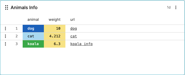
Add Temporary Events and URLs
Use the createEvents() and
table() functions combined to add new events to
a table. You can also add field-related URLs and make those URLs
linkable in your table, like in this table:
|
Figure 173. Table with New Fields and URLs
From the
Searchtab, type a query like this in the Query Editor:logscalecreateEvents(["animal=dog weight=10.0 url=\"[dog](https://google.com/search?q=dog)\"", "animal=cat weight=4.212 url=\"[cat](https://google.com/search?q=cat)\"", "animal=koala weight=6.300 url=\"[koala info](https://google.com/search?q=koala)\""]) | kvParse() | table([animal, weight, url])The output table has newly created fields animal, weight and url as its columns.
Save your widget as explained at Create from a Query
Click the menu icon on top-right of the widget and select , the Styling panel is displayed:
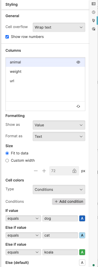
Figure 174. Properties Panel - Example 2
Click the field animal in the Columns section and set properties like this:
Formatting → Show as → Format as
Size →
Cell colors → because you want to assign a specific color for each different value (dog, cat, etc.).
Click the field weight in the Columns section and set properties like this:
Formatting → Show as → Format as ; you also want to round the values for the animal weight to 2 decimal places.
Cell colors → choose a color (yellow in the example) for any value.
Click the field url in the Columns section and set in particular:
Formatting → Show as because you want your URLs to be linkable. As seen in the example, labels for URLs are supported.
For all the available properties that you can use to customize your widget, see Table Widget Properties.