
Single Value Widget
The Single Value widget can either
display a single number — errors per day or active connections to
a system, for example — or string values, like for instance words
e.g., "Success" or even symbols.
For a representation of single numeric values, you may also want to use a Gauge Widget.
This widget can display any data with a single row and a single field, containing a number or a string.
See in Figure 157, “Single Value Widget” an example of how this widget may look like.
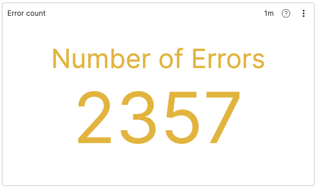 |
Figure 157. Single Value Widget
Because this widget can display any "single" value (regardless of whether it's a number or not), a row with multiple fields in it would not make sense as you would have multiple potential values to pick from; therefore, if there are multiple rows, or there are multiple fields in a row, the widget will present an error.
An exception to the above behaviour is possible by using the
timeChart() function, in which case there can be
multiple rows or data, used to calculate a trend — see
Example: Displaying a Trend with a Timechart
for more details.
Input Format
The Single Value widget is often used
in conjunction with functions such as sum(),
count(), or avg() which
produce a single row with a single field, like
_sum.
The widget can also be used on data where you have produced a single
row with only one field. The select() and
selectLast() functions are very useful for this.
For single-value results based on grouping on a single field, the widget also supports data visualization in multiple charts arranged in a grid — one small chart for each of the field values — allowing them to be easily compared. See Example: Displaying Values in a Grid.
Example: Displaying Number of Errors
To show the number of errors in a system, you could count them using:
loglevel = /error/i
| count()
This produces a single result with a field _count. The Single Value widget will automatically select the first numeric field it sees and use it as the value to display.
Example: Displaying Statistics from a Build
If you use LogScale to monitor how your software is building, your build pipeline might already output the numbers you want, like the number of failed tests. Instead of calculating this number based on the failed tests that have been logged, you can display the number the system has given you:
commit = 67686a1
| /Tests failed: (?<tests_failed>\d+)/
| select(tests_failed)
Assuming there is only one build per commit, this search extracts
the number of tests that failed in the build, and uses the
select() function to remove extraneous fields
from the row. Without calling select(), the row
might contain multiple numeric fields, and the Single Value widget
would not know what to display.
Example: Displaying a Non-Numeric Value
The examples above described use cases with number values; instead,
the following example shows how the Single
Value widget can also display a non-numeric value;
for example, you may set an emoji symbol to depict the state of a
particular outcome from your events:
tail(1)
| case {
    fieldA = "true"
| emoji := "😀"
    *
| emoji := "😔"
}
| select(emoji)
This query produces a single result with a field called
emoji and specifies that the emoji will be set
to "😀" if a given fieldA is
true, else it will be set to
"😔":
 |
Figure 158. Non-Numeric Single Value Widget
Example: Displaying a Trend with a Timechart
The Single Value widget can be
efficiently used in conjunction with the
timeChart() function.
timeChart(span=1h)This query produces a result containing the number of ingested events per hour. The result contains two fields: _bucket and _count. The _bucket field annotates each bucket with a timestamp, whereas the _count field is the value (number of events ingested).
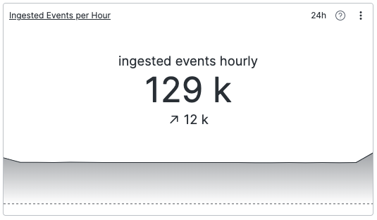 |
Figure 159. Single Value Widget with TimeChart()
When used with a timeChart() function in the
search, specific styling options become available for the widget,
allowing it to show the following:
A value — The main central number indicates the value, in this case _count, in the last bucket, depending on whether the Last Bucket property has been set to include it or not, see Widget Properties.
A trend — The difference in the value field, in this case _count, over the selected period. This is calculated by subtracting the value of the first bucket from the value of the last bucket.
A sparkline — Illustrates the value over time if the Sparkline property is toggled (see Widget Properties). Along with the trend, this is useful to give some context to the value that you're looking at. For example, it can indicate whether the value you're looking at is volatile, or if it's relatively stable.
Example: Displaying Values in a Grid
The Single Value widget used in
conjunction with timeChart() or
groupBy() functions can visualize results in a
grid of multiple charts.
With timeChart() used with a series field like
method:
timechart(method)Values and trends for each individual result are displayed next to each other:
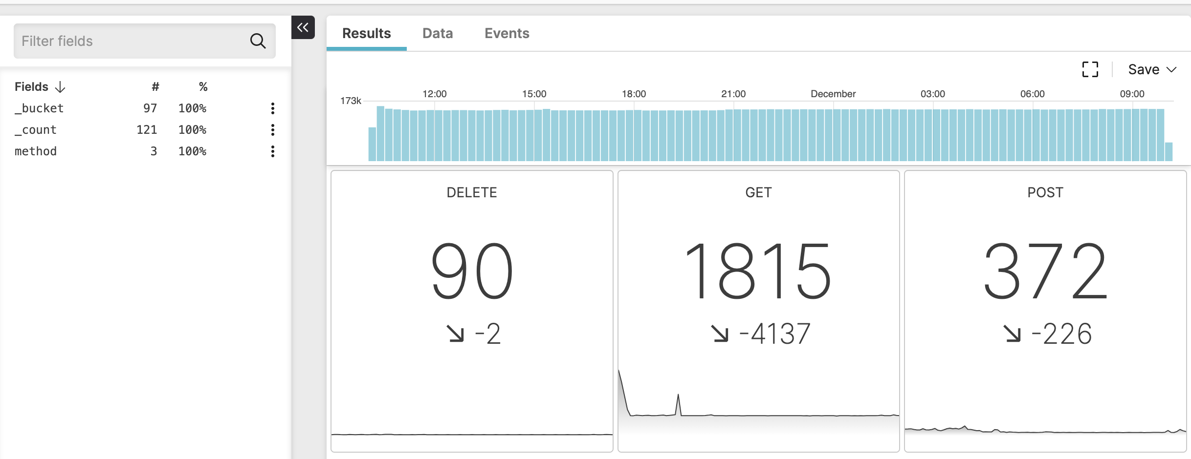 |
Figure 160. Single Value Widget with Small Multiples
A similar visualization can be achieved with
groupBy() on a single field together with
count().
Widget Properties
From the widget menu (see Figure 113, “Widget Menu”) click to set the properties in the Styling panel. All the possible available properties are described in the list that follows.
There are some special properties that don't apply all the time, they
are instead only available when the Single
Value widget uses the timeChart()
function in the search: in the list below, these special properties
are highlighted with a note. Their use case is described at
Example: Displaying a Trend with a Timechart.
Title
The title of the widget as displayed in the dashboard.
Description
The description of the chart. This is free form text supporting markdown syntax.
This same description appears in the dashboard as a tooltip by hovering over the question mark on top of the widget.
Text
Label
Provides a definition to be displayed along with the number or text. For example, Number of Errors.
Value
Format
The available units that can be used to express values. Valid options are:
Rawshows the actual numbers (e.g., 4987).Metricformats the value as a number with appropriate rounding (e.g., 4987 will be shown as 5k).Timeconverts the value to a time span (years, months, days, hours, minutes, seconds...), depending on the input type selected.
Input type
Enabled when the
Timeformat is selected, gives the input units available to express values.Valid options are:
MillisecondsSeconds
Decimal places
Enabled when the
RaworMetricformats are selected, indicates the number of digits past the decimal point. It is possible to do number rounding by providing negative decimal places e.g., a decimal place of -2 would format the number 123 to 100.Suffix
Allows to provide any symbol or definition useful to describe the resulting value. For example,
$orms.
Buckets
Note
This property is available only when the
timeChart()function is used.Controls whether the first and last buckets that are currently receiving live data must be shown in the embedded timechart or not. Valid options are:
First Bucket
The first bucket might be incomplete. If it's included, the trend and the sparkline will be affected. Options are:
ExcludeInclude
Last Bucket
The last bucket might be incomplete. If it's included, the trend, sparkline and actual value will be affected. Options are:
ExcludeInclude
Trend
Note
This property is available only when the
timeChart()function is used.When toggled, shows in the timechart the delta between the value of the first bucket and the value of the last bucket.
Show as
Allows to choose the format of the trend value between two options:
Absolute valuePercentage
Sparkline
Note
This property is available only when the
timeChart()function is used.When toggled, draws the timechart line or curve that estimates the relationship between the main single value and the trend.
Style
Controls the appearance of the sparkline in the timechart. Options are:
Gradientapplies gradient colors to the sparkline area fill.Linedraws just the sparkline without any fill.
Show line for zero checkbox
Colors
Controls the colors of the widget for the different available methods.
Method
Dropdown menu options are:
Static— controls the color of the number or string in the widget using the Text field; modifies the background color using the Background field.By thresholdallows to set thresholds for specific ranges in numeric value results, thus displaying the result in different colors.By trendallows to customize the color profile of the displayed single value by trend (see this option explained at Example: Displaying a Trend with a Timechart).
When the
By thresholdmethod is selected, the following properties allow to change the color of the resulting value.Critical High — the result is displayed in red if it exceeds the value set in this box.
High — the result is displayed in yellow if it exceeds the value set in this box.
Low — the result is displayed in yellow if it is below the value set in this box.
Critical Low — the result is displayed in red if it is below the value set in this box.
For example, a result of 600 turns red if you've set
500as Critical High.The result is colored green by default when no thresholds are set, or in case it's in between the values set in Low and High boxes.
When the
By trendmethod is selected, the following properties allow to customize the colors of the different outputs in the widget, which can be:Neutral — the default color is grey.
Positive — the default color is green.
Negative — the default color is red.
For any of the above outputs, colors can be set for both Text and Background.
In dark mode, the default text colors are a tad darker and the background is black.
Small multiples
When toggled, the query result is partitioned using the first grouping field or the specified field in the settings, and a visualization for each subresult is displayed in a grid.
Field name — name of the field used to partition the query result.
Number of columns — the number of columns in the grid. If the number of visualizations are less than the desired number of columns, the number of visualizations are used instead. If the resulting size of each visualization will be smaller than 150px, the number of columns are also overwritten by the maximum possible.
Show borders — allows to show or hide a border around each visualization.