
Scatter Chart Widget
The Scatter Chart widget is useful for
discovering the connection between different metrics in your data: it
can be used to visualize any results containing two or more sets of
correlated numerical values, in the form of scatter plot points. The
first set of numerical values in the result will function as points on
the X-axis, whereas all following sets will be plotted as series in the
chart.
See in Figure 158, “Scatter Chart” an example of how this widget may look like.
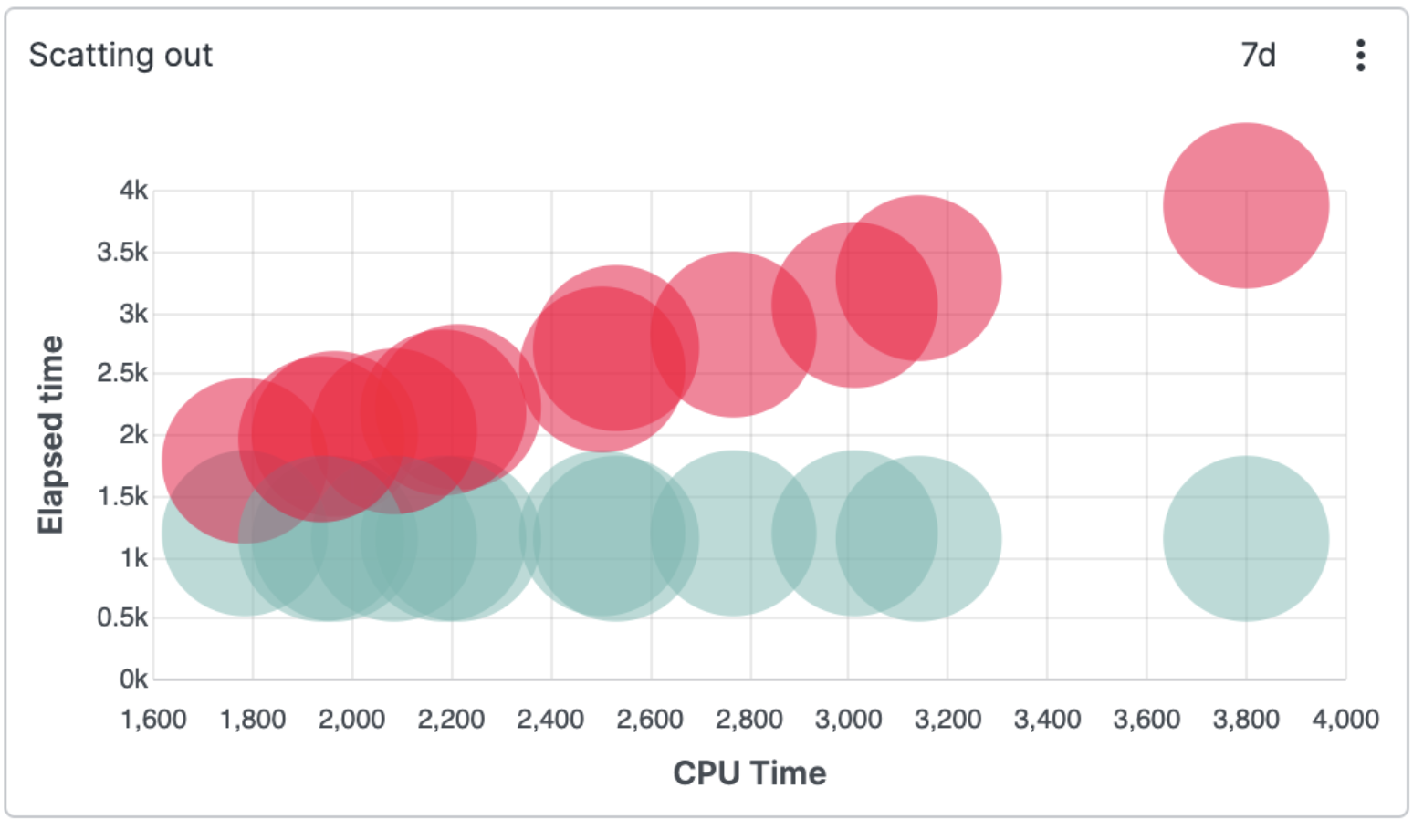 |
Figure 158. Scatter Chart
Input Format
You can use the Scatter Chart with a
single series to have a service producing logs like the ones below:
2022-03-14T10:59:02.387+0000 INFO c.h.u.TimerExecutor$ 3 cputime=266935 wallclock=269564 alloc=4712
2022-03-14T10:59:02.389+0000 INFO c.h.u.TimerExecutor$ 1 cputime=17521 wallclock=19430 alloc=40
2022-03-14T10:59:02.419+0000 INFO c.h.u.TimerExecutor$ 3 cputime=95658 wallclock=98754 alloc=64
Assuming we would like to make a chart showing the correlation between
cputime,
wallclock and memory allocation
alloc, we will use the
table() function:
table([cputime, wallclock, alloc])
This query will produce a Scatter Chart
with cputime as the X-axis and
wallclock and
alloc as two series of plotted
numerical values (as in
Figure 158, “Scatter Chart”). Any
additional inputs to the table() function field
list would add more series to the chart.
The Scatter Chart is also meant to be
used in conjunction with other functions such as
select(), groupBy(),
timeChart(), bucket(), and
top().
Wide or Long Input Format
The Scatter Chart offers the
Input Data Format property,
whose Auto mode looks at the query result and
automatically chooses the best interpretation of the data between
long or wide data format.
Long format data must have one group field for the series names and two additional fields for x and y values respectively.
Wide format must have at least two fields (neither needs to be a group field), the first one is used for x values and any subsequent fields contain y values. There is a limit of 49 series when the wide format is chosen (50 in total, but the x axis takes the first slot).
Notice that a group field is the field used as the first argument to
either groupBy(), bucket()
or timeChart() functions.
See an example of Auto mode selecting the long data
format, where we will use a nested groupBy()
function:
groupBy(#vhost, function=[groupBy(alloc)])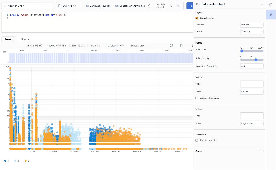 |
Figure 159. Scatter Chart Selecting Long Format
Widget Properties
Use the widget's panel to configure the following properties.
Title
The title of the widget as displayed in the dashboard.
Description
The description of the bar chart. This is free form text supporting markdown syntax.
Legend
Show Legend checkbox.
Tick the box to show the legend in the chart.
Position
Choose where you want the legend to appear in the chart. Valid options are:
RightBottom
Labels
You have two options for displaying labels:
Truncateshortens the length of the series for a better visualization within the chart. It is used in case of long labels that would exceed the maximum space allowed in the chart. It is the default option. Hover the mouse over a label, then press and hold ALT to momentarily see the full series.Show fullshows the full name of the series, that is, the entire value is displayed in the label or tooltip. In case of very long labels, it might affect their visibility within the chart. Hover the mouse over a label, then press and hold ALT to momentarily see the truncated series.
Points
Controls the appearance of points in the chart.
Point Size
Reduces or increases the size of each data point.
Point Opacity
Reduces or increases the opacity of each data point.
Input Data Format
How to interpret the resulting query data. Valid options are:
Autoenables automatic selection of long or wide formats.Longuses one field for the series.Wideuses a distinct field for each series.
X-Axis
Title
Gives a title to the X-Axis.
Scale
Valid options are:
Linear— quantitative scales that preserve proportional differences.Logarithmic— quantitative scales particularly useful for plotting data that varies over multiple orders of magnitude.
Always show zero checkbox
Tick the box to include the point 0 on the horizontal axis. If, for example, all values are in the range 100-200, by default the axis will only show that range roughly. But you can force it to extent the axis to 0. That makes it easier to get a sense of the absolute numbers, not just the numbers relative to each other.
Y-Axis
Title
Gives a title to the Y-Axis.
Scale
Valid options are:
Linear— quantitative scales that preserve proportional differences.Logarithmic— quantitative scales particularly useful for plotting data that varies over multiple orders of magnitude.Always show zero checkbox
Tick the box to include the point 0 on the vertical axis. If, for example, all values are in the range 100-200, by default the axis will only show that range roughly. But you can force it to extent the axis to 0. That makes it easier to get a sense of the absolute numbers, not just the numbers relative to each other.
Trend Line
A line or curve that estimates the relationship between X and Y values. In some cases, a straight line is the best fit. But there might be cases where other types of graphs may better estimate the relationship.
Enable trend line checkbox.
Tick the box to visualize the trend line.
Type
When Enable trend line is checked, enables to set the type of regression type to be visualized in the chart. Valid options are:
Linear— a straight line described by the formulay = ax +bLogarithmic—y = a + b * log(x)Exponential—y = a + e(b * x)Power—y = a * xbQuadratic—y = a + b * x + c * x2Polynomial—y = a + b * x + ... * x^order
Series
Assign a color to the series and provide a title to be displayed in chart.