
Heat Map Widget
The Heat Map widget is a colorized grid
chart that displays a central variable of interest across two-axis
variables. In LogScale, this is typically the result of grouping on two
categorical variables or binned numerical values.
See an example of how this widget may look like in Figure 150, “Heat Map Widget”.
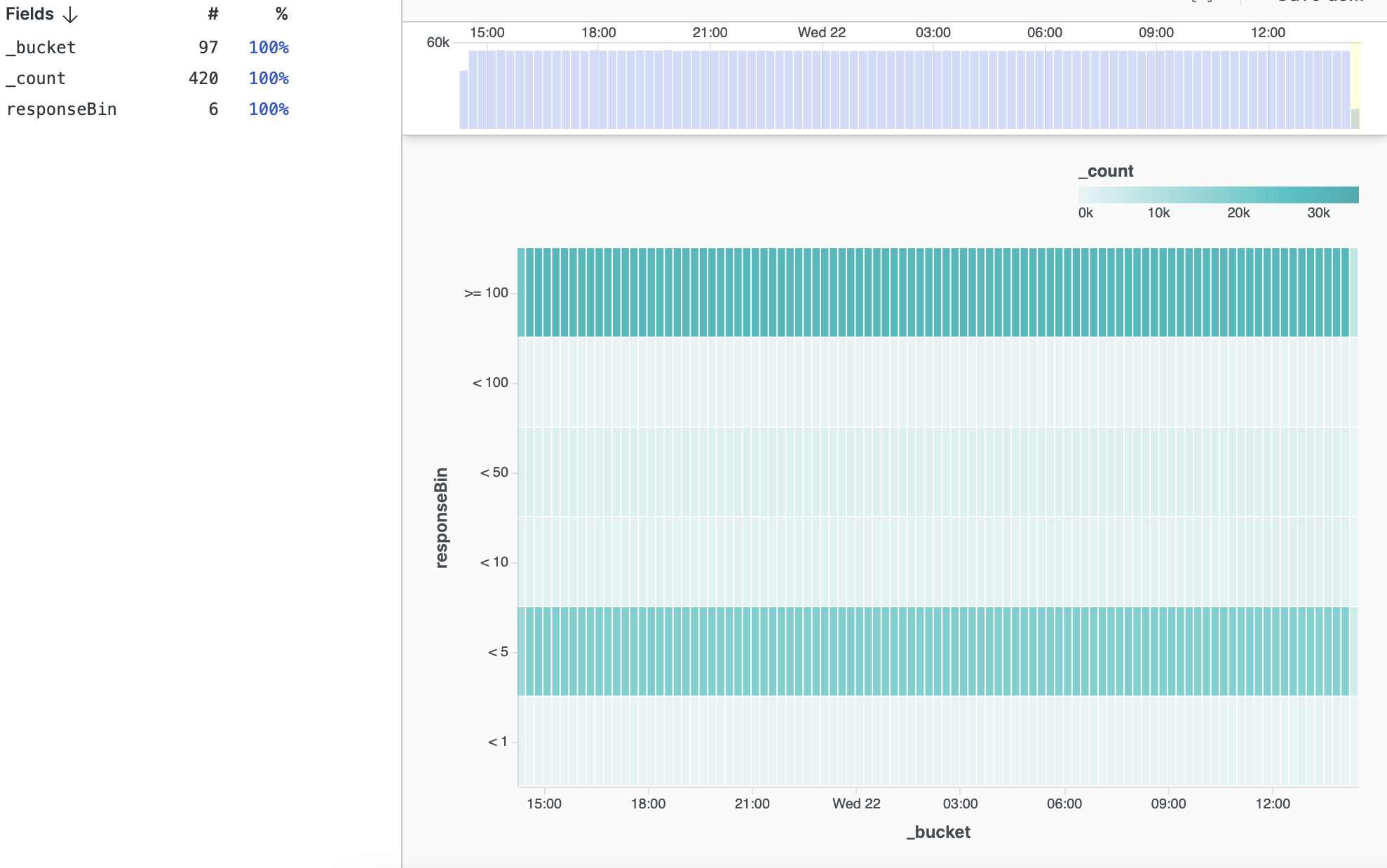 |
Figure 150. Heat Map Widget
Input Format
You can use the Heat Map widget to visualize results of the
groupBy(), top(),
bucket(), and timeChart()
query functions. In all cases, the result needs to contain two
grouping variables and a third variable with the aggregate result.
Thus, for groupBy() and
top() you need to specify two fields to group by,
and for bucket() and
timeChart() you need to specify a single field to
group by along with the timestamp.
Example 1: Github Push Events
The Heat Map widget is typically well
suited when there is an inherent ordering to both the axis variables
and you want to have, for instance, an overview of how many events
fall into each combination of those variables.
One example taken from a Github sample dataset is the push activity — at what times during a week are there most activities on Github based on push events.
type="PushEvent"
| dayOfWeekName := time:dayOfWeekName()
| dayOfWeek := time:dayOfWeek()
| hour := time:hour()
| groupBy([dayOfWeekName, dayOfWeek, hour])
| sort([dayOfWeek, hour], type=[number, number], order=[asc, desc], limit=200)
| drop(dayOfWeek)
This query creates dayOfWeek (and data of week
number for sorting) and hour of day fields and
computes a groupBy with the default
_count aggregate function. Finally the query
sorts the result such that both the Y-axis and X-axis are sorted.
This type of query is best suited when all combinations of the
grouping fields are present, otherwise the sorting of the heat map
may be inconsistent.
Example 2: Response Time
The Heat Map widget can be used to
detect how many events have a certain level of response time over
time. The following query generates the result for a heat map
showing this information.
case{
responseTime < 1
| responseBin := "< 1"
| responseBinNumber := 1;
responseTime < 5
| responseBin := "< 5"
| responseBinNumber := 2;
responseTime < 10
| responseBin := "< 10"
| responseBinNumber := 3;
responseTime < 50
| responseBin := "< 50"
| responseBinNumber := 4 ;
responseTime < 100
| responseBin := "< 100"
| responseBinNumber := 5;
*
| responseBin := ">= 100"
| responseBinNumber := 6;
}
| bucket(field=[responseBin, responseBinNumber])
| sort(responseBinNumber, limit=1000)
| drop(responseBinNumber)
The query first bins the response time and then computes an
aggregated result using the bucket() function
with the binned response time as the specified field. Finally, the
query sorts the result by responseBinNumber
such that the Y-axis of the map will be sorted.
Widget Properties
Use the widget's panel or the brush icon on the right-hand side of the main Event List pane to configure the following properties.
Title
The title of the widget as displayed in the dashboard.
Description
The description of the bar chart. This is free form text supporting markdown syntax.
This same description will appear in the dashboard as a tooltip by hovering over the question mark on top of the widget.
Layout
Gridlines
Checkbox to enable/disable gridlines in the chart.
X-Axis
Max Label Length
Slider to set the length of labels in the horizontal axis, in pixels. The chosen length affects the distance between labels.
Text Anchor
Controls where the label is positioned under the grid. Options are:
LeftCenterRight
Angle
Slider to modify the angle of the label in the horizontal axis.
Show Title
Checkbox to show/hide the title assigned to the horizontal axis.
Custom Title
Allows to change the default title of the horizontal axis and assign a preferred one.
Y-Axis
Max Label Length
Slider to set the length of labels in the vertical axis, in pixels.
Show Title
Checkbox to show/hide the title assigned to the vertical axis.
Custom Title
Allows to change the default title of the vertical axis and assign a preferred one.
Legend
Location
Sets the position of the legend in the chart. Valid options are:
TopRight
Min Value
Sets the minimum value of the legend range. If an input aggregate value is below the specified value, it will be mapped to the minimum color.
Max Value
Sets the maximum value of the legend range. If an input aggregate value is above the specified value, it will be mapped to the maximum color.
Show Title
Checkbox to show/hide the title assigned to the legend.
Custom Title
Allows to change the default title of the label and assign a preferred one.
Tooltip
Appears when hovering over a cell and shows the X-axis and Y-axis values together with the aggregate value of the cell.
Include Histogram
Checkbox to show/hide a histogram in the tooltip. The histogram displays hovered columns as bar charts to reveal content.
Colors
Palette
Allows to change the color of the grid; options are:
Teal MonochromeMagenta MonochromePeach MonochromeBlue MonochromeGreen MonochromeGreen Red Diverging
Reverse
Checkbox to select/deselect the inverted colors option (all the colors are the opposite in the grid).