
Gauge Widget
The Gauge widget serves as a visual
representation of a single numeric value within a defined range.
It is used for providing context, example use cases include:
Show errors per day and indicate whether values are approaching critical levels
Represent the progress of vulnerability assessment and remediation efforts
Monitor system resource utilization, like CPU or memory utilization.
The Gauge widget supports two
representations of the current value:
Needle representation, which mimics the traditional analog gauges such as speedometers.
Filler representation, which provides a dynamic option to fill a segment of the gauge based on the current value.
See in Figure 146, “Gauge Chart” an example of how this widget looks like.
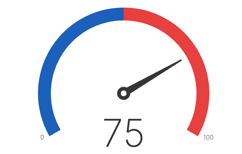 |
Figure 146. Gauge Chart
Input Format
As the Gauge widget is using a numeric
scale, it is compatible with queries that output a single numeric
field such as sum(),
count(), or avg() which
produce a single row with a single field (e.g.
_sum).
For visualizing text values instead, see Single Value Widget.
For results based on grouping on a single field, the widget also supports data visualization in multiple charts arranged in a grid, allowing them to be easily compared, see Display Small Multiple Charts.
You can customize your widget by changing its default values range and its formatting: see Gauge Widget Properties.
For examples on how to create Gauge
widgets, see
Creating Gauge Chart Widgets.
Gauge Widget Properties
From the widget menu (see Figure 113, “Widget Menu”) click to set:
Title
The title of the widget as displayed in the dashboard.
Description
The description of the widget. This is free form text supporting markdown syntax. The description appears in the dashboard as a tooltip when hovering over the question mark on top of the widget.
Click to configure the widget's properties (find some Styling panel examples at Creating Gauge Chart Widgets):
Layout
Type can be:
— A radial gauge where the value is indicated by a colored arc.
— A radial gauge where the value is indicated by a needle.
Padding — Percentage of widget height or width used for padding. Useful when labels will otherwise be clipped.
Value
Format — The available units that can be used to express values. Valid options are:
shows the number without formatting (e.g., 4987)
shows the number abbreviated as thousands (K), millions (M), billions (B), or trillions (T).
shows the number abbreviated with metric (SI) prefixes.
converts the value to a time span (years, months, days, hours, minutes, seconds...), depending on the input type selected.
Input type — Enabled when the format is selected, gives the input units available to express values. Valid options are:
Milliseconds
Seconds
Decimal places — Enabled when the or formats are selected, indicates the number of digits past the decimal point. It is possible to do number rounding by providing negative decimal places e.g., a decimal place of -2 would format the number 123 to 100.
Suffix allows to provide any symbol or definition useful to describe the resulting value. For example,
$orms.
Range defines the minimum and maximum values of the gauge. Options are:
Min value — default is
0Max value — default is
100allows to display these values in the chart.
Colors to customize the chart colors.
Palette allows to choose a predefined palette of colors (can be diverging colors or monochrome with different nuances) automatically assigned to thresholds.
Thresholds allows to configure thresholds for the selected colors, for example light green applied to all values below 50, dark green for all above 100. You can modify the color for any threshold: this will turn the palette to a Custom palette. Multiple thresholds are supported.
Labels — A list of labels and associated anchor values. Anchor values describe where on the gauge the label is drawn. For example, an anchor value of 50 on a range from 0 to 100 would draw the label at the midpoint of the gauge.
Small multiples
When toggled, the query result is partitioned using the first grouping field or the specified field in the settings, and a visualization for each subresult is displayed in a grid.
Field name — name of the field used to partition the query result.
Number of columns — the number of columns in the grid. If the number of visualizations are less than the desired number of columns, the number of visualizations are used instead. If the resulting size of each visualization will be smaller than 150px, the number of columns are also overwritten by the maximum possible.
Show borders — allows to show or hide a border around each visualization.
Creating Gauge Chart Widgets
The procedure for creating Gauge
widgets is described in the examples that follow.
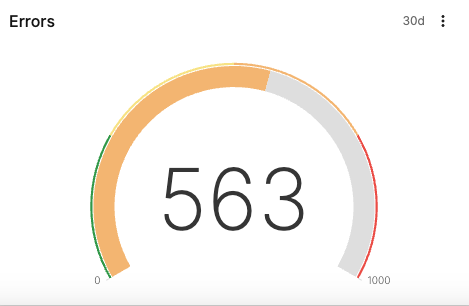
Display Number of Errors — A gauge that displays the number of errors found in the system.
Display Query Memory — A gauge for monitoring query memory usage.
Display Small Multiple Charts — Values based on grouping of a single field are displayed in small charts:
Display Number of Errors
To show the number of errors in a system, you could count them using
the count() function.
From the
Searchtab, type this query in the Query Editor:logscaleloglevel = /error/i | count()Save your widget as explained at Create from a Query
Click the menu icon on top-right of the widget and select , the Styling panel is displayed on the side of the widget:
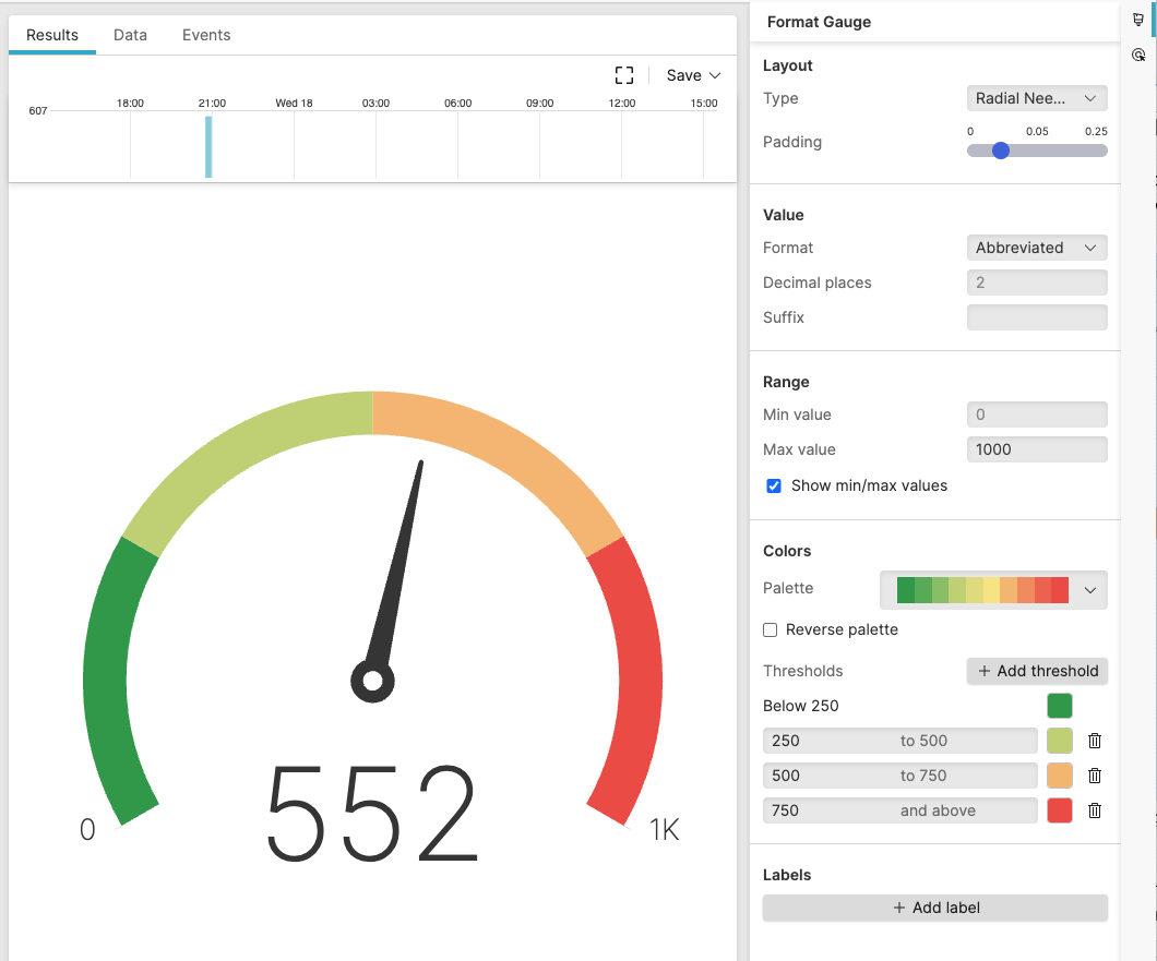
Figure 147. Gauge Chart with Properties Panel - Example 1
Set the properties as desired:
Layout → choose type in this example
Value → choose format
Colors → adjust the colors for the thresholds you have defined, thus creating a custom palette.
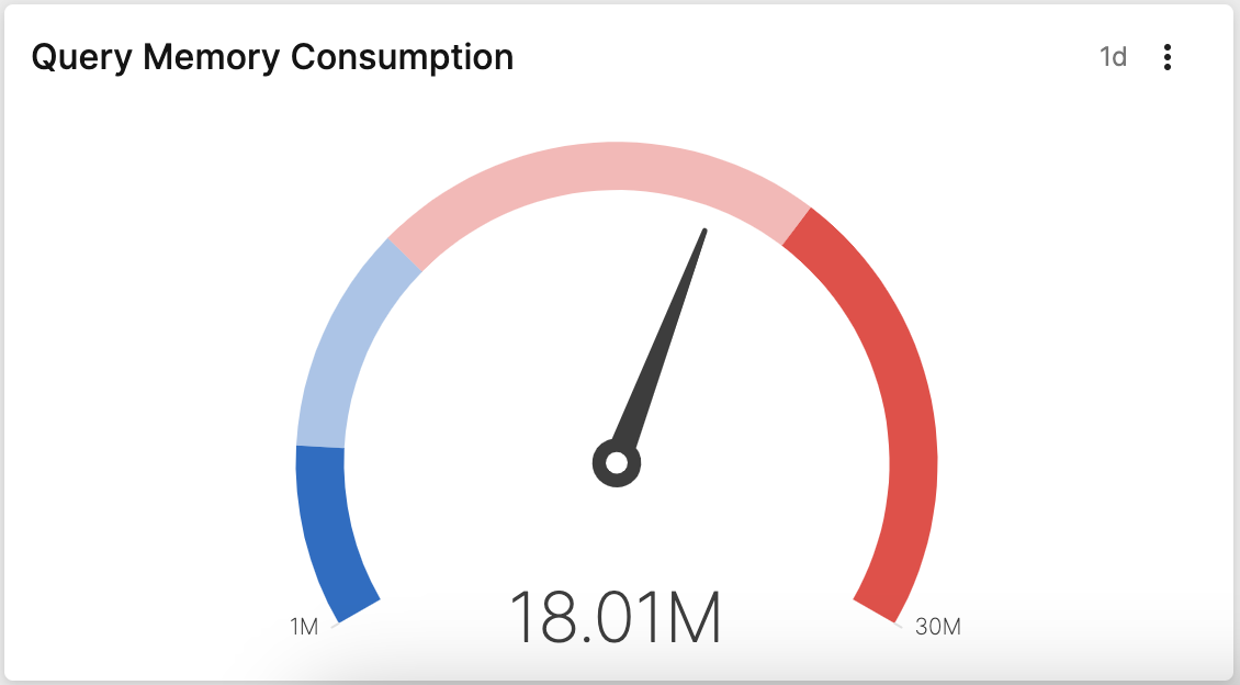
Display Query Memory
If you use LogScale to monitor your costs in terms of memory consumption, you can display the average memory allocated for your queries activity.
From the
Searchtab, type this query in the Query Editor:logscale"direct memory allocated" | group=query |avg(bytes)This search extracts the events having
queryas the value found for the group field, and uses theavg()function to calculate the average memory allocation of queries in the system, in bytes.Save your widget as explained at Create from a Query
Click the menu icon on top-right of the widget and select , the Styling panel is displayed on the side of the widget:
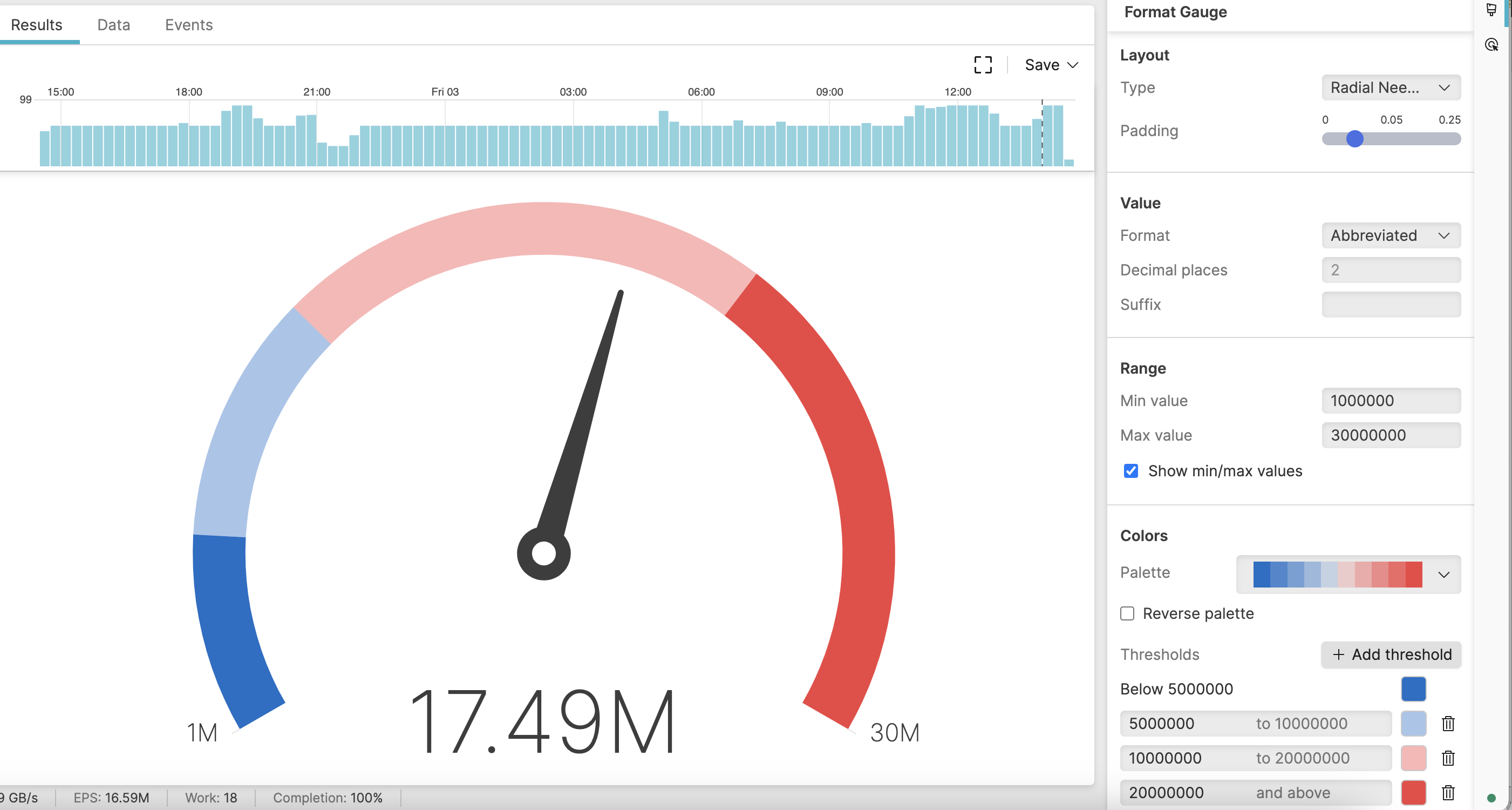
Figure 148. Gauge Chart with Properties Panel - Example 2
Set the properties as desired:
Layout → choose type in this example
Value → choose the format to show the values as millions (M)
Range → define the min and max values your widget should display
Colors → choose a palette among those available
Thresholds → set consistent thresholds according to your data: for example, you want values exceeding 20 millions bytes of memory displayed in red.
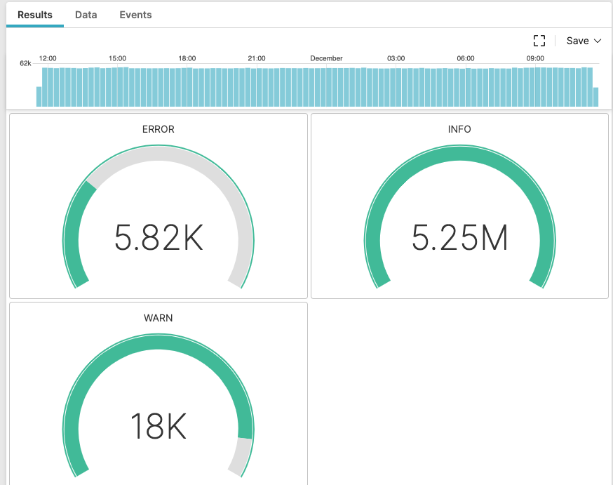
Display Small Multiple Charts
You can compare results for the different values of a field: for
example, how many ERRORS,
INFO and
WARN values for the
field loglevel are returned, and display them
next to each other in a grid.
From the
Searchtab, type this query in the Query Editor:logscalegroupBy(loglevel)This search groups values of field loglevel.
Save your widget as explained at Create from a Query
Click the menu icon on top-right of the widget and select , the Styling panel is displayed on the side of the widget:
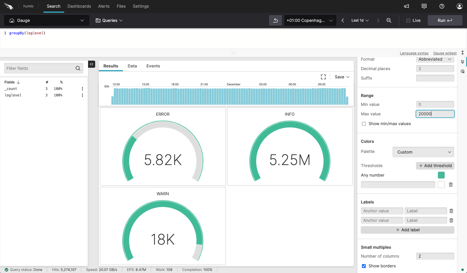
Figure 149. Gauge Chart with Properties Panel - Example 3
Set the properties as desired:
Layout → choose type in this example
Value → choose the format
Range → define the min and max values your widget should display
Colors → any number should have the same color
Small multiples → the grid should display small multiples in 2 columns