


Values in a Grid
Display results for multiple series side by side as a grid of individual single value charts. Useful when you want to monitor the same metric — for example, event count or error rate — broken down by a categorical field such as HTTP method or service name, all in one dashboard tile.
Visualization: when
timeChart() is used with a series field, the
widget renders one individual single value chart per series value,
arranged side by side. Each chart shows its own value, trend, and
optional sparkline:
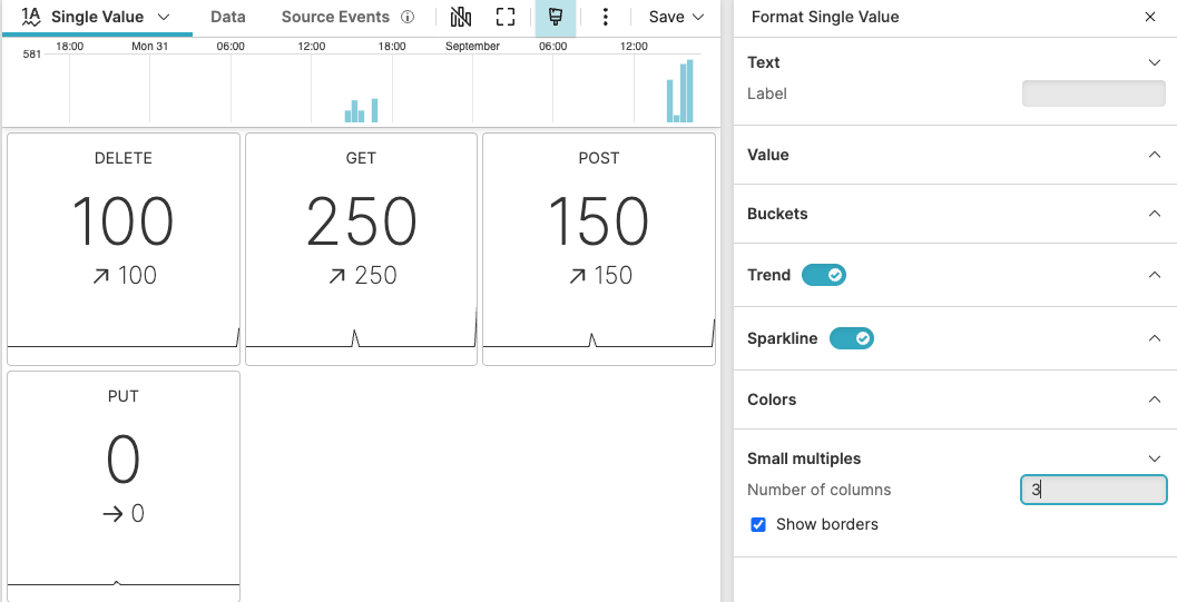 |
Figure 253. Single Value Widget — Values in a Grid
Sample input data:
| @timestamp | endpoint | method | status |
|---|---|---|---|
| 1970-01-01T00:00:02 | /api/users | GET | 200 |
| 1970-01-01T00:00:02 | /api/orders | POST | 201 |
| 1970-01-01T00:00:02 | /api/items | DELETE | 204 |
| 1970-01-01T00:00:02 | /api/products | GET | 200 |
| 1970-01-01T00:00:02 | /api/auth | POST | 400 |
Query:
timeChart(method)Query breakdown:
Groups events into time buckets and further splits each bucket by the method field, producing one count per method per time bucket.
The
Single Valuewidget renders one individual chart per unique method value, each showing its own value, trend, and sparkline.
A similar grid visualization can be achieved with
groupBy() on a single field together with
count().
Configuration:
From the
Searchpage, type your query in the Query Editor → clickChoose in the Widget selector
Click the style icon : this opens the Format panel on the side.
Toggle the Trend property on to show the change between the first and last bucket values below the main number.
Toggle the Sparkline property on so each individual chart in the grid shows its historical trend.
Under Small multiples, set Number of columns to control how many charts appear per row, and optionally enable Show borders to add borders between the individual charts.
To customize this widget further, see Single Value Property Reference.