


Job CPU Time vs Elapsed Time
Compare CPU time and elapsed time across jobs to identify whether
different job types exhibit distinct performance patterns. Using a
nested groupBy() on a low-cardinality field such
as job_type produces long
format data, which the scatter chart renders as distinct colored
clusters — one color per job type — making it easy to see
whether batch and realtime jobs occupy different regions of the chart.
Visualization: the scatter chart
displays one point per job, grouped by job type (long format). The
outer groupBy() on
job_type becomes the series,
giving each job type a distinct color:
X-axis (horizontal) shows CPU time in milliseconds (cpu_ms)
Y-axis (vertical) shows average elapsed time in milliseconds (elapsed_ms)
Each colored cluster represents one job type. Points within a cluster are individual jobs of that type: cluster separation reveals whether job types have fundamentally different resource profiles.
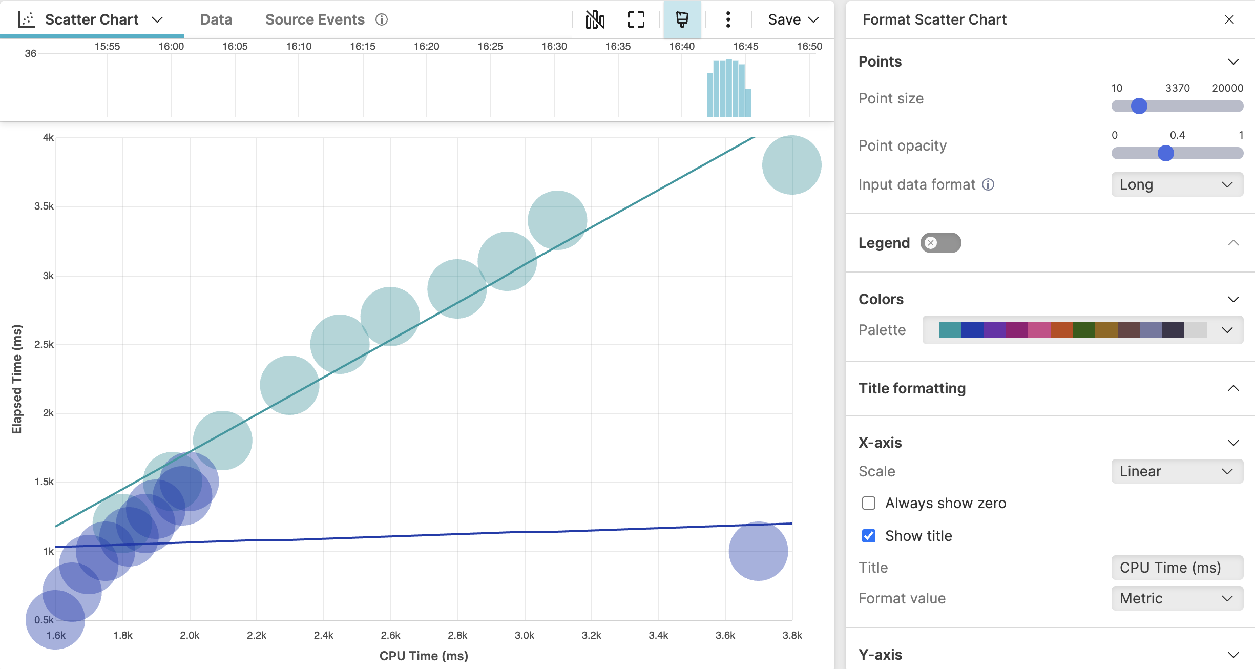 |
Figure 194. Job CPU Time vs Elapsed Time
Sample input data:
| @timestamp | cpu_ms | elapsed_ms | host | job_id | job_type |
|---|---|---|---|---|---|
| 2025-08-11T00:01:00 | 1800 | 1200 | worker-01 | batch-001 | batch |
| 2025-08-11T00:01:01 | 2450 | 2500 | worker-02 | batch-002 | batch |
| 2025-08-11T00:01:02 | 3100 | 3400 | worker-01 | batch-003 | batch |
| 2025-08-11T00:01:03 | 1600 | 500 | worker-03 | realtime-001 | realtime |
| 2025-08-11T00:01:04 | 1900 | 1300 | worker-04 | realtime-002 | realtime |
Query:
groupBy(job_type, function=[groupBy(cpu_ms, function=avg(elapsed_ms, as=elapsed_ms))])Query breakdown:
The outer
groupBy()on job_type is the group field: it has low cardinality (two values:batchandrealtime) and becomes the series name, giving each job type a distinct color.The inner
groupBy()on cpu_ms produces one result row per unique CPU time value within each job type, computing the average elapsed time for each.The result has exactly three fields — job_type (series), cpu_ms (X-axis), and elapsed_ms (Y-axis) — which is the structure required for long format to render distinct colored clusters.
Configuration:
From the
Searchpage, type your query in the Query Editor → clickChoose in the Widget selector
Click the style icon : this opens the Format panel on the side where some properties are already configured by default based on the query result.
Set Input data format to
Longto ensure the chart renders the two job types as distinct colored clusters.In Points, increase the Point size slider and reduce Point opacity so overlapping points remain visible.
In Colors, select a Palette to assign distinct colors to each job type cluster.
Toggle Trend line on to display a regression line for each cluster.
In X-axis, enter a custom axis title such as
CPU Time (ms).In Y-axis, enter a custom axis title such as
Elapsed Time (ms).
To customize this widget further, see Scatter Chart Property Reference.