


CPU vs Memory Usage
Correlate CPU and memory consumption across services to identify resource-hungry outliers. Useful for spotting services that consume disproportionate memory relative to their CPU usage, or for detecting anomalous resource spikes before they become incidents.
Visualization: the scatter chart displays one point per service, where:
X-axis (horizontal) shows average CPU usage percentage (avgCPU)
Y-axis (vertical) shows average memory usage percentage (avgMemory)
Each point represents one service. Points in the upper-right quadrant indicate services with high CPU and high memory usage.
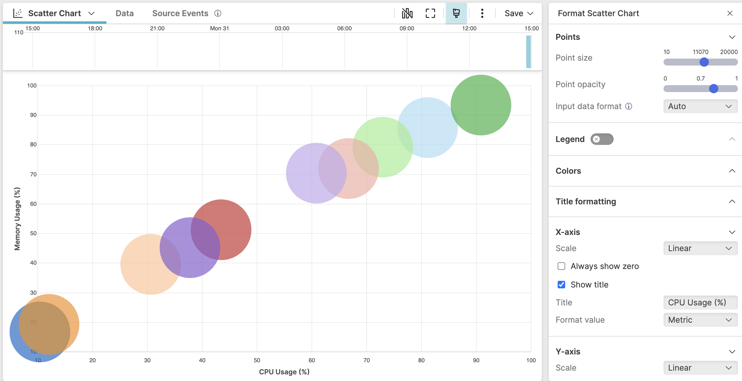 |
Figure 193. CPU vs Memory Usage
Sample input data:
| @timestamp | cpu_pct | environment | mem_pct | service |
|---|---|---|---|---|
| 2025-08-11T00:01:00 | 12.4 | production | 23.1 | auth-service |
| 2025-08-11T00:01:01 | 78.9 | production | 85.4 | payment-service |
| 2025-08-11T00:01:02 | 34.1 | production | 41.7 | user-service |
| 2025-08-11T00:01:03 | 91.2 | production | 92.6 | analytics-service |
| 2025-08-11T00:01:04 | 5.7 | staging | 11.3 | cache-service |
Query:
groupBy(service, function=[avg(cpu_pct, as=avgCPU), avg(mem_pct, as=avgMemory)])Query breakdown:
Groups all events by the service field, producing one result row per unique service.
Calculates the average CPU usage across all events for each service and stores the result in avgCPU.
Calculates the average memory usage across all events for each service and stores the result in avgMemory.
Configuration:
From the
Searchpage, type your query in the Query Editor → clickChoose in the Widget selector
Click the style icon : this opens the Format panel on the side where some properties are already configured by default based on the query result.
Modify the properties to obtain the look and feel in this example, such as:
In X-axis, select avgCPU as the field and enter a custom axis title such as
CPU Usage (%).In Y-axis, select avgMemory as the field and enter a custom axis title such as
Memory Usage (%).In Series formatting, leave Name empty so the formatting applies to all series, then enter service in the Label field so each point displays its service name.
In Points, increase the Point size slider to make the data points more visible in the chart.
To customize this widget further, see Scatter Chart Property Reference.