
Bar Chart Widget
The Bar Chart widget represents aggregate
data values as rectangular bars. The varying bar lengths help users
identify data patterns and trends.
Bar chart visualization excels at comparing quantities across categories or tracking changes over time units, such as weekly or monthly trends.
Figure 131, “Bar Chart” shows an example of this widget.
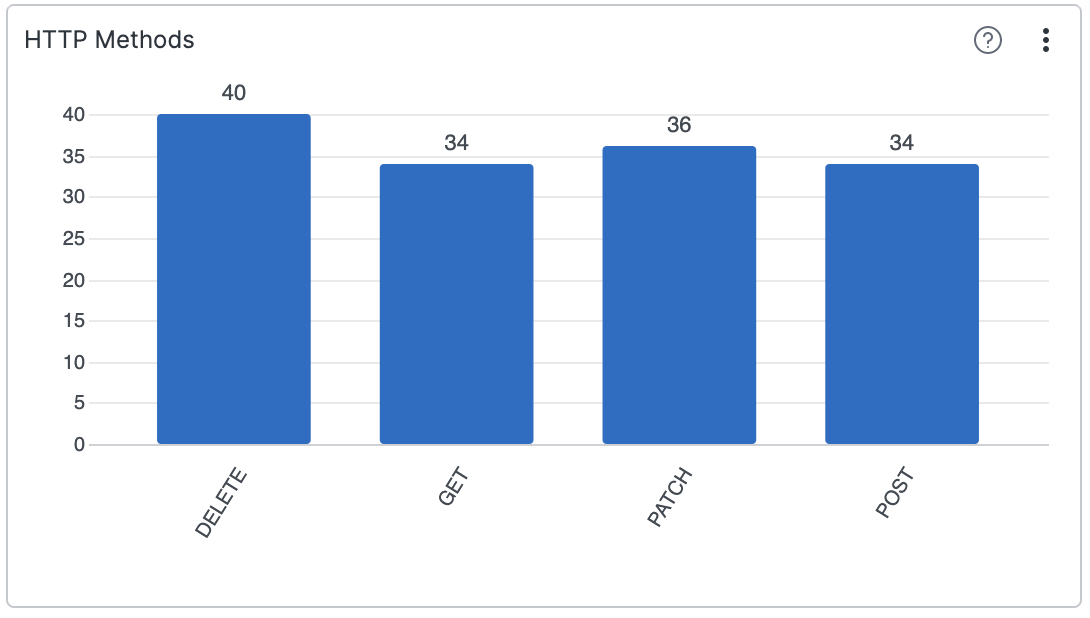 |
Figure 131. Bar Chart
Input Format
You can use the Bar Chart widget to
visualize results of the groupBy() and
top() functions. Unlike the Pie
Chart, a bar chart can be used to show multiple
aggregate results. If you provide several aggregate functions to the
function
argument of groupBy(), the chart will display one
result per function.
This example shows multiple series per category, using log entries generated from a service:
2018-10-10T01:10:11.322Z host=web01 reponseTime=10.2ms
2018-10-10T01:10:12.172Z host=web01 reponseTime=2.6ms
2018-10-10T01:10:14.122Z host=web02 reponseTime=11.5ms
2018-10-10T01:10:15.312Z host=web01 reponseTime=14.7ms
2018-10-10T01:10:16.912Z host=web03 reponseTime=10.8ms
A bar chart can compare maximum and average response time for each host.
groupBy(host, function=[max(responseTime), avg(responseTime)])This query will produce one bar chart with three categories (one per host) and two series, one per aggregate result (_max, and _avg).
Wide or Long Input Format
The Bar Chart offers the
Input Data Format property,
whose Auto mode looks at the
query result and automatically chooses the best interpretation of
the data between long or wide data format.
Longdata format is selected if there is more than one group field (made withgroupBy([a,b])). Otherwise,Widedata input format is selected.
In Long data format mode, the
first grouped field contains the categories. Subsequent grouped
fields are concatenated to form the series. The first non-grouped
field contains the y-value. Example:
groupBy([status, internal])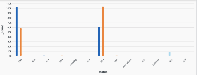 |
Figure 132. Bar Chart Selecting Long Format
The data depicted in the below table view show what fields are visualized on the chart.
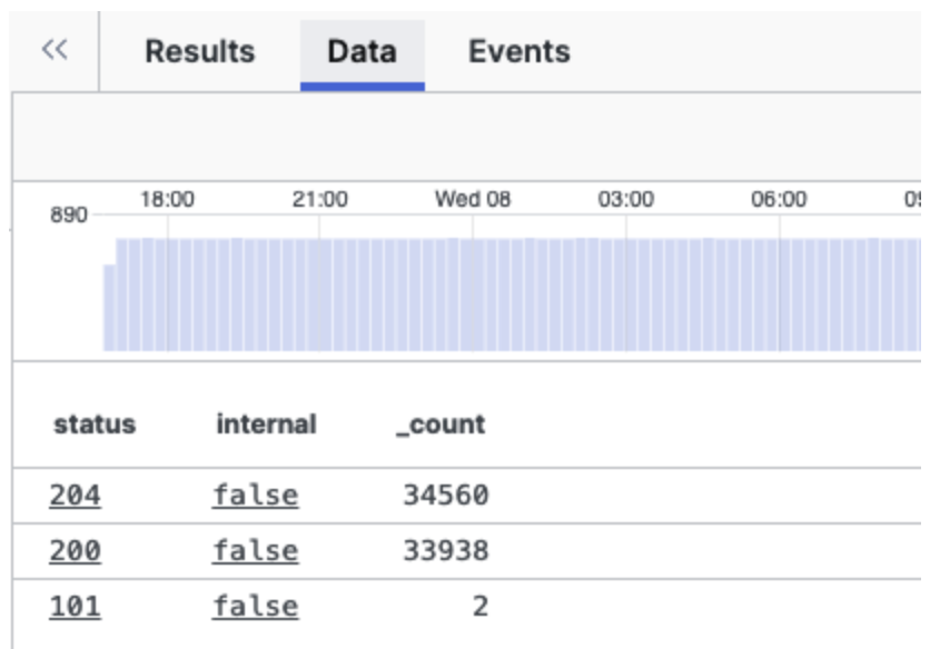 |
Figure 133. Long Format Table View
Wide: All grouped fields are concatenated and form the category (x-axis). Each non grouped field becomes a series. Example:
groupBy(status, function=[avg(contentLength, as=content), avg(time, as="time")])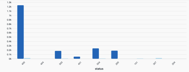 |
Figure 134. Bar Chart Selecting Wide Format
Note
A group field is the field used as the first argument to the
groupBy() function.
Attention
Charts in existing dashboards (prior to the introduction of the
Auto mode) with
groupBy([a,b]) queries and former default
mode still set to Wide will
look different as they are automatically switched to
Long data input format.
Widget Properties
In the widget side panel (Figure 102, “Widget Menu”), click the icon to configure the following properties.
General properties:
Title
The title of the widget as displayed in the dashboard. As in the example Figure 131, “Bar Chart”, it could be HTTP Methods.
Description
The description of the bar chart. This is free form text supporting markdown syntax. For example, This chart shows all HTTP methods, except
PUTandHEAD.This same description will appear in the dashboard as a tool-tip by hovering over the question mark on top of the widget.
Default time properties. The default widget time only works when Shared time is toggled off by default. Save the dashboard to set the current time selection as the default.
Time
Start
End
In the widget side panel (Figure 102, “Widget Menu”), click the brush icon to configure the following properties.
Layout
Type
Grouped— places series next to each other on a group for each categoryStacked— places series on top of each other for each category
Category axis
Show title checkbox to show the title for the category (horizontal) axis.
Title gives a title to the vertical axis.
Text anchor controls where the labels are positioned under each bar. Valid options are:
Leftwill bring labels closer to the bars.CenterRightAngle
Modifies the angle of the label displayed under each bar.
Max length
Sets the space (in pixels) between labels and the widget's bottom edge. Increasing this value reduces the graph's size.
Value axis (left)
Show title shows the title chosen for the value axis on the left.
Title gives a title to the value axis.
Type The scale type for the axis. Valid options are:
Linear— a quantitative scale that preserve proportional differences.Logarithmic— a nonlinear quantitative scale particularly useful for plotting data that varies over multiple orders of magnitude.
Legend toggle which allows showing or hiding the legend in the chart. If selected, it prompts the following properties:
Labels Valid options are:
Truncate— shortens the length of the series for a better visualization within the chart. It is used in case of long labels that would exceed the maximum space allowed in the chart. It is the default option. Hover the mouse over a label, then press and hold ALT to momentarily see the full series.Show full— shows the full name of the series, that is, the entire value is displayed in the label or tool-tip. In case of very long labels, it might affect their visibility within the chart. Hover the mouse over a label, then press and hold ALT to momentarily see the truncated series.
Position sets the position of the legend in the chart. Valid options are:
RightBottom
Show Title checkbox
Allows to show or hide the legend's title.
Title
Text field to enter the desired title for the legend when Show Title is ticked.
Bars
Show value on bars shows the given value for each bar.
Category padding
Use this setting to control the distance between categories in the chart.
Series padding
Use this setting to control the distance between bars within a category.
Max series count
Limits the number of series shown in a category. Series with the lowest cumulative sum across categories will be grouped into one series called "Other".
Input data format
How to interpret the result query data. Valid options are:
Autois selected by default and enables automatic detection of long or wide format — for details, see Wide or Long Input FormatWide— data stored in wide format has a column for each series (variable) with the series name as the header and the values as rows. For example, this format is useful when data is grouped by a single field and multiple aggregate functions are used.Long— data stored in long format has a single column for each named series (variable) and a single column with the values. For example, this format is useful when data is grouped by two fields.
Sorting
The default sorting is by X axis labels.
Order by series
Specifies the name of the field to order the series by.
Order orders the series names alphabetically.
Valid options are:
AscendingDescending
Series
Change the color of the bar series and assign them the title you want to see displayed in the chart.