
Gauge Widget
Updated:Gauge Widget v1.112.0
An updated version of the Gauge widget was introduced in v1.112.0, see Gauge Widget.
Removed:1.40
The Gauge widget has been replaced by
the Single Value widget.
The Gauge widget displays a single number
that indicates errors per day or the active connections to a system.
This widget can display any data with at least one field containing a number. If there are multiple rows with numeric fields, or there are multiple numeric fields in a row, the widget will present an error.
See in Figure 137, “Gauge Chart” an example of how this widget looks like.
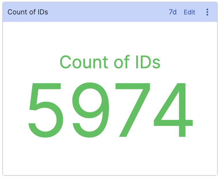 |
Figure 137. Gauge Chart
Input Format
The Gauge widget is often used in
conjunction with functions such as sum(),
count(), or avg() which
produce a single row with a single field like
_sum.
The widget can also be used on data where you have produced a single
row with only one numeric field. The select() and
selectLast() functions are very useful for this.
Example: Displaying Number of Errors
To show the number of errors in a system, you could count them using:
loglevel = /error/i
| count()
This produces a single result with a field
_count. The
Gauge widget will automatically
select the first numeric field it sees and use it as the value to
display.
Example: Displaying Statistics from a Build
If you use LogScale to monitor how your software is building, your build pipeline might already output the numbers you want, like the number of failed tests. Instead of calculating this number based on the failed tests that have been logged, you can display the number the system has given you:
commit = 67686a1
| /Tests failed: (?<tests_failed>\d+)/
| select(tests_failed)
Assuming there is only one build per commit, this search extracts
the number of tests that failed in the build, and uses the
select() to remove extraneous fields from the
row. Without calling select(), the row might
contain multiple numeric fields, and the Gauge widget would not know
what to display.
Widget Properties
Use the widget's panel to configure the following properties.
Title
The title of the widget as displayed in the dashboard.
Description
The description of the time chart. This is free form text supporting markdown syntax.
This same description appears in the dashboard as a tool-tip by hovering over the question mark on top of the widget.
Presets
Load Preset
The available units that can be used to express values. Valid options are:
BitsBytesSecondsMilliseconds
Text
Label
Provides a definition to be displayed along with the number. For example, Count of IDs.
Suffix
For example,
ms.Decimal Places
The number of digits past the decimal point. It is possible to do number rounding by providing negative decimal places, e.g. decimal place of -2, would format the number 123 to 100.
Automatic unit scaling
Checkbox that allows you to set the following parameters:
Scale
Valid options are:
Metric— formats the value as a number with appropriate rounding (e.g., 4987 will be shown as 5k).Time— converts the value to a time span (years, months, days, hours, minutes, seconds...), depending on the Input Unit selected.
Input Unit
The input units available to express values.
Valid options are:
MillisecondsSeconds
Thresholds
Enable Thresholds
Checkbox that sets thresholds for different value ranges. The gauge number displayed will assume a different colour depending on the range you have set.
Valid options are:
Critical High
High
Low
Critical Low
For example, a result of 600 turns red if you've set
>500as Critical High.